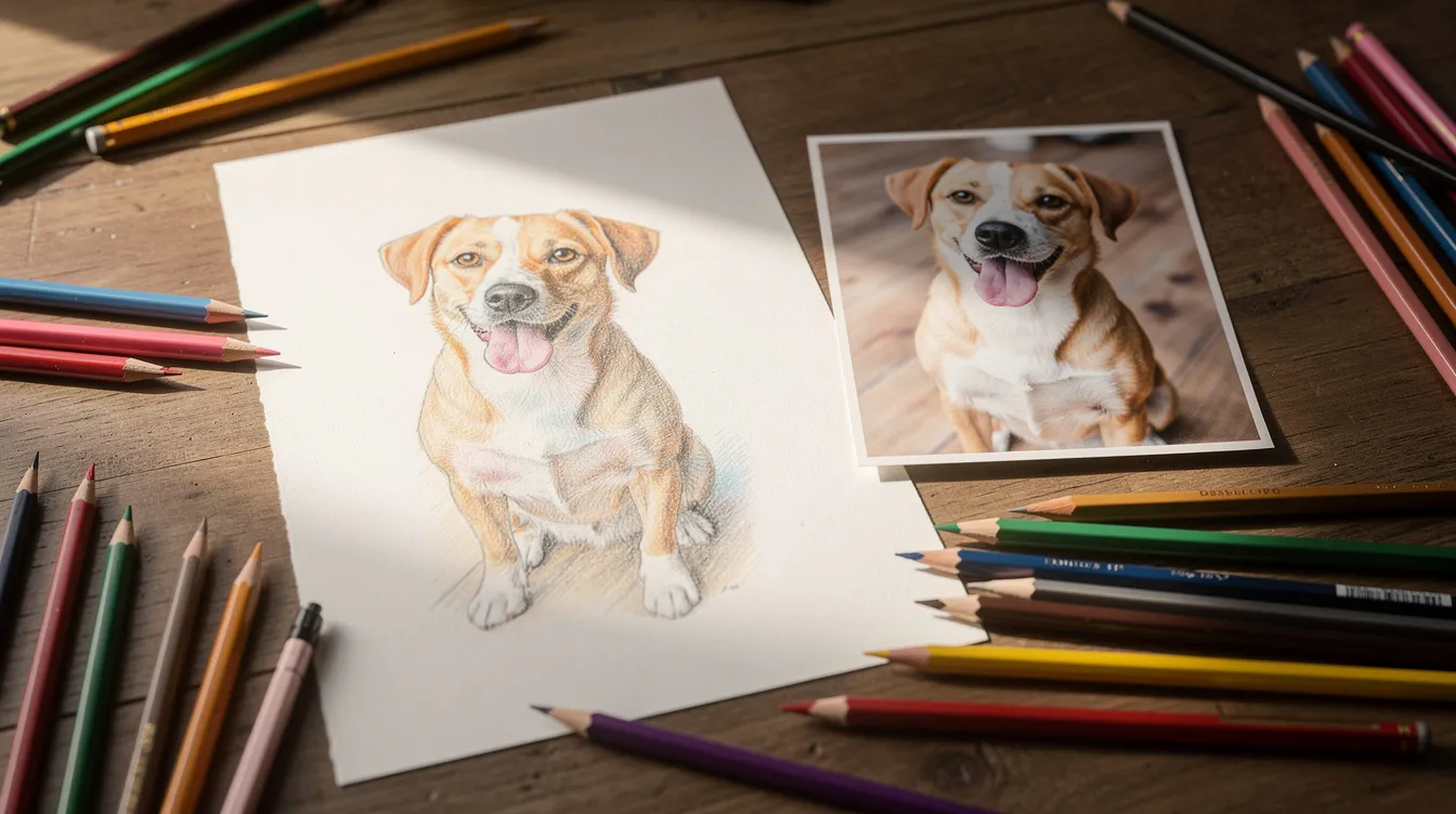
If you are learning to draw still life compositions, pets, portraits, or anything at all, this article is for you. Using photographs as reference material for drawing is a common practice, and drawing from photographs is a foundational skill used by artists at all levels. Some teachers say never use photos. Others rely on them completely. The truth is somewhere in the middle, and that’s the approach we’ll take here: balanced, practical, and focused on building real skill.
This guide will show you how to choose strong reference photos, how to photograph your own subjects, and several concrete methods to transfer images onto your page: freehand, grid, light board, projection, and more. The goal is to help you use photo reference in a way that actively grows your drawing skills, not as a shortcut that quietly replaces them.
Understanding Drawing From Photos: Tool, Not Crutch
Suppose you ask a friend to sit for a portrait. Twenty minutes in, they’re shifting, checking their phone, and the light from the window has moved. You snap a single well-lit photo, and suddenly you have all the visual information you need, frozen in a moment, ready whenever you are.
That’s the power of reference photos. The term means images used for information and inspiration, proportions, value, lighting, gesture, not necessarily copied line for line. There’s an important distinction here:
- Mechanical copying: reproducing every pixel, aiming for a hyper realistic drawing that looks “exactly like the picture.”
- Interpretation: using the photo as a starting point while applying your knowledge of form, anatomy, perspective, and composition.
This article leans toward interpretation, because that’s how you actually improve, with real emphasis on understanding rather than copying.
Even historical masters used optical aids like the camera obscura – Vermeer, Canaletto, and others projected real scenes onto surfaces for tracing, part of the longer history that eventually includes photography. So photo reference isn’t “wrong.” It’s a tool with a long history. But here’s the honest part: drawing from photos can inhibit the development of drawing skills if you never push beyond copying. Many students fail to draw from life in high school art classes, and that gap follows them. We want to close it, not widen it.
Why Working From Photographs Can Be More Reliable Than Working From Life
Picture this. You set up a bowl of fruit at 3 pm by a window. Beautiful light, clear shadows. You start drawing. By 4 pm, the light has shifted, the shadows have moved, and your reference has changed underneath you. Now picture the same scene as a photograph. That light stays exactly where it was. Forever.
This is the single biggest advantage of working from a photo. Consistent lighting means you can:
- See value shapes clearly and practice shading without your shadows drifting.
- Take breaks and return to identical conditions days later.
- Work in short sessions over many days without losing the pose or expression.
Photos remain completely still, allowing study of intricate details that would otherwise shift or disappear. Cameras can capture high-speed actions that the human eye cannot process – a bird mid-flight, a dog catching a ball, a child mid-laugh. These subjects are almost impossible to draw from real life during long studies. Photographs make them practical.
Photos provide greater detail than the human eye can see in many situations. Photographs capture fine details, making them useful for realistic drawings of texture, fur, fabric, or architecture. Photographs allow artists to study complex forms without a moving subject, which is a great gift for busy adults who can’t spend three hours watching a live model hold a pose.
And because a photograph is already a flat surface, already 2D, it removes one mental step. You don’t have to translate 3D space onto paper. For early learners, that simplification builds confidence.
Limitations and Pitfalls of Drawing From Photos (And How to Avoid Them)
Here’s where I have to warn you. Photos may flatten details and subtle color variations. They may compress space, distort perspective, and if you only copy them literally, your understanding of real form and light can stall. Drawing from photos can hinder skill development when used carelessly.
Specific issues students run into:
- Flash and auto-exposure that kills subtle shadows. Camera limitations include a limited dynamic range that can obscure subtle values you need for shading.
- Lens distortion: camera lenses can distort perspective and facial features in photographs. Wide-angle selfies make noses enormous. Buildings bend at the edges.
- Over-sharpened detail that encourages fussy rendering without structure. Photos often provide less accurate color and light information than what your eye would see in person.
The biggest danger is “pixel copying” – staring at tiny shapes and textures without understanding the larger forms underneath. Copying from photos limits understanding of three-dimensional space. Drawing from photos limits spatial understanding and perspective. The result? Copying from photos often results in flat, lifeless artwork, and drawing from photos can lead to mechanical copying rather than creativity.
Drawing from photos can create a false sense of achievement – your work looks “accurate,” but it is rarely complete just because it matches the photo, and you may not actually understand why.
Concrete fixes:
- Before rendering any detail, ask: “What is the underlying form here?”
- Combine photo reference with memory or quick life sketches when possible.
- Adjust, simplify, or correct known distortions in your drawing, don’t just reproduce them.
Many artists find drawing from life essential for skill development, and they’re right. But you can absolutely use photos and still build strong drawing skills, as long as you think in 3D and don’t blindly trust everything the camera shows.
How to Choose Strong Reference Photos for Drawing
Your drawing will only be as clear as the information in your reference photo. A muddy, low-contrast snapshot makes the job needlessly hard. Photos can simplify complex visual information into shapes and values, but only if the photo itself is good.
Here’s what to look for:
Criteria | What It Means | Example |
|---|---|---|
Clear light direction | One dominant light source with readable shadows | Portrait lit from a window on the left, not five ceiling lights |
Distinct value range | Darks, mids, and lights all visible | You can see at least three distinct tonal zones |
Sufficient resolution | Forms stay readable when you zoom in | At least 2000 pixels on the long side |
Strong silhouette | Subject reads clearly even at tiny size | A dog in profile against a light wall, not lost in clutter |
Composition in the reference matters too. Avoid awkward crops that cut off joints or fingertips unless that’s intentional. Look for readable shapes and simple backgrounds that don’t compete with the subject.
Warning: over-filtered social media images destroy real value relationships and skin tones. Heavy filters make terrible learning tools. If someone’s face looks orange and the shadows are purple, that’s the filter talking, not reality.
Quick checklist before you commit to a photo:
- Is the light clear and directional?
- Can I read the subject at thumbnail size?
- Do I understand where the main forms are?
If the answer to all three is yes, you’ve got something worth drawing.
Taking Your Own Reference Photos: Control Over Light, Pose, and Composition
Using your own photos gives control over light and composition – and that control makes a real difference. You decide the pose, camera angle, lighting setup, and background. No hunting through stock sites. No copyright worries.
The setup tips below explain how to photograph subjects so your references are easier to draw from.
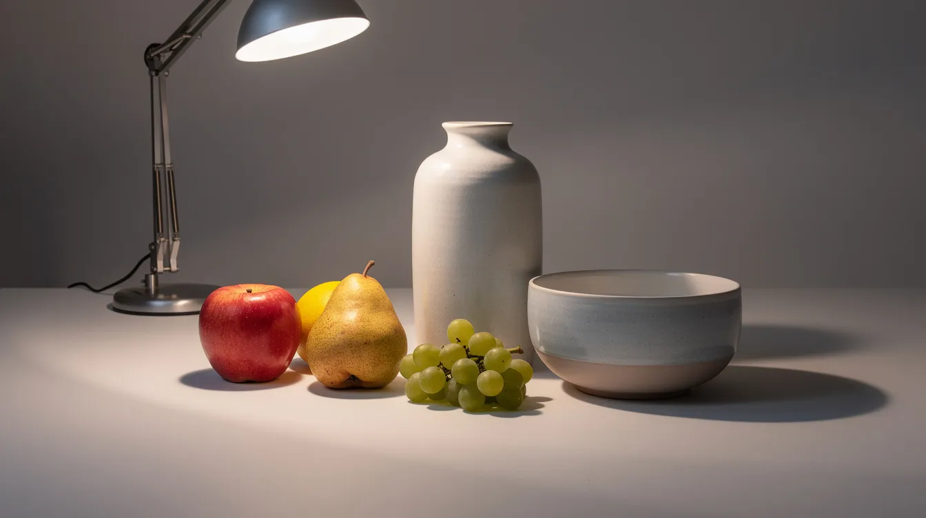
Simple home setup for still life:
- A small table by a window for soft, consistent light.
- A single desk lamp placed at a 45° angle, to create clear shadows on objects like a white mug, a red apple, or glass bottles.
- A neutral background, like plain cloth or paper, to avoid clutter.
Photographing pets or people:
- Take many shots quickly rather than forcing a person or animal to hold still. Burst mode is your friend for animals who won’t sit for more than two seconds.
- Move yourself to try different heights and angles – eye-level, slightly above, slightly below.
- Capture expressions that feel real, not stiff “photo smile” poses. Natural gestures read better in a drawing.
Try shooting at different times of day, 9 am, noon, golden hour, to discover how shadows and colors shift. Choose the version with the clearest forms for your drawing.
Keep a simple reference library. Organize photos into folders: “hands,” “fabric folds,” “street scenes,” “cats,” “self-portraits.” This is a resource you’ll return to constantly. Tools like PureRef or simple folder systems on your phone work fine. The point is having quality images ready when inspiration strikes. Building your own library also makes regular practice feel more fun and sustainable, especially when you pair it with structured courses that teach core drawing fundamentals.
Working With Found Images and Online Photo References: Ethics and Practical Tips
Finding ideal reference photos can be time-consuming and difficult, especially when you need something specific: a particular pose, a certain lighting scenario, a scene you can’t stage at home. But grabbing random images off a search engine is risky: copyright issues and zero control over quality.
Better sources include:
- Public domain archives (pre-1929 photographs from museum collections).
- Stock photo sites with clear royalty-free licenses.
- Photo packs specifically designed as art reference, like Reformma’s figure archive which offers naturalistic, everyday poses tagged by lighting and body type.
Artists can source imagery from anywhere instantly using photographs, but ethics matter. For portraits or recognizable people, get permission or change the image significantly – alter the pose, features, background, or lighting so it becomes your own interpretation.
Using multiple photos can enhance understanding and creativity in drawing. Many artists use multiple reference photos for one artwork – one photo for the pose, another for lighting, a third for costume or texture. This naturally pushes your work away from direct copying and into original composition.
Over-reliance on a single photo can limit the development of observation skills. Always credit your reference sources in your notes or when you post your artwork online. It’s a professional habit and keeps you honest about what’s original versus derived.
Using Photo Reference to Build Real Detail
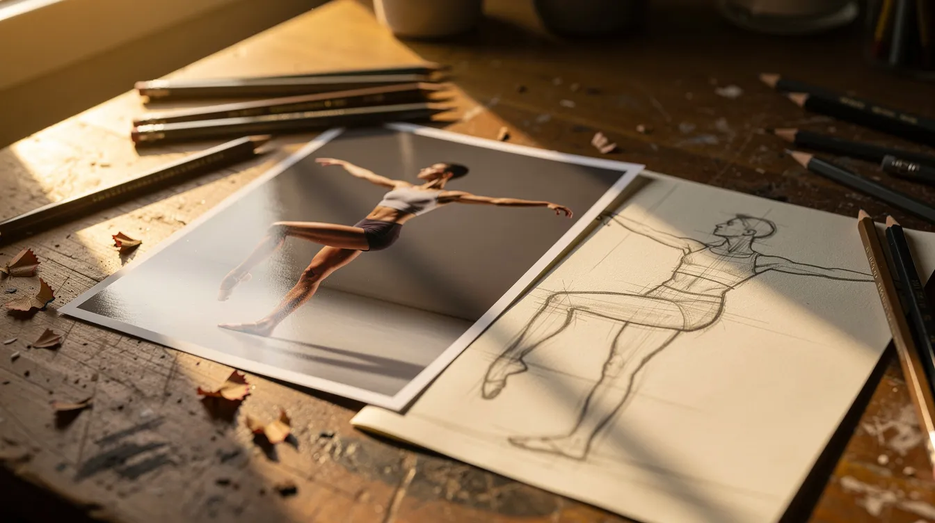
Every time you look at a reference photo, you have a choice: copy it passively, or use it to train your eye and brain. Relying heavily on photographs can lead to passive copying rather than interpretation. Relying on photos can inhibit the development of drawing skills if you never move beyond reproduction. So let’s talk about how to actively learn.
Exercises that build skill:
- Gesture studies: Set a timer for 30–90 seconds. Rapidly sketch small, loose gestures from figure photos. Focus on movement and weight, not detail.
- Form analysis: Print a reference photo, lay tracing paper over it, and outline the simple geometric forms inside complex objects: cylinders in arms, spheres in skulls, boxes in torsos.
- Memory drawing: Study a photo for two minutes, close it, then draw from memory. Compare your drawing to the reference and note what you missed.
Photographs are useful for studying anatomy, perspective, and proportions. But always ask: where is the light source in 3D space? How would this subject look if I turned it 90 degrees? What forms would still be there?
Drawing from life enhances understanding of three-dimensional space and light and form in ways photos simply can’t replicate. Practicing drawing from life develops better observational skills, and working through step-by-step lessons on drawing faces can reinforce that understanding on more complex subjects. So alternate: draw your own hand from life one day, then from a photo you took the next day, which also helps prepare you for college-level critique. Compare what each teaches you. The combination is where real progress happens.
Composition and Lighting: Designing Strong Drawings From Photo References
A reference photo is a starting point, not a prison. You’re allowed – encouraged, even – to move objects, crop differently, and redesign the light in your drawing. That’s where your own opinions and artistic voice come in.
Composition examples:
- Turn a cluttered kitchen snapshot into a focused still life by cropping in on just the kettle, mug, and folded towel.
- Move a pet slightly off-center to create more interesting negative space instead of parking the subject dead-center.
How to evaluate composition:
- Shrink your reference to thumbnail size. If you can’t read the main shapes and focal point, your drawing will also be unclear.
- Check for tangents: a person’s head “touching” the edge of a doorway, for example – and fix them in your sketch.
Lighting design is where the magic happens. For beginner studies, prefer references with one dominant light source. A right-side window, a single lamp. Something that creates clear, distinct shadows. If your favorite photo has messy, multi-directional light, simplify it in your drawing. Decide where the “main” light comes from and adjust all shadows accordingly.
For more advanced work, combine lighting cues from multiple references. Use your knowledge of how light wraps around form rather than obeying the camera exactly. Many artists find this is where drawing becomes less about copying a scene and more about designing a masterpiece inspired by reality.
Methods to Transfer a Reference Photo Onto Your Drawing Surface
Transferring is about mapping proportions and placement. The artistic work, your interpretation of light, edges, value, and detail, still happens after the layout is down.
Main options:
- Freehand and measured drawing
- Grid method
- Light board tracing
- Projection
- Digital underdrawing
A common fear: using tools makes your work “cheating.” It doesn’t – as long as your goal is learning and you also practice freehand to grow your eye. Choose the method based on the project:
Project Type | Best Method |
|---|---|
Quick sketch or study | Freehand |
Large, detailed portrait | Grid or light board |
Complex multi-reference composition | Light pencil planning with grid or overlays |
Mural or oversized painting | Projector |
Try at least two different transfer methods on the same photo once. You’ll feel the difference in speed, accuracy, and what you actually learn from each process.
Freehand and Measured Drawing From Photos
Freehand drawing from a photo is excellent training because you must observe and judge proportions yourself. No mechanical aid is doing the thinking for you. It’s harder. It’s slower. And it builds real skill.
Step-by-step approach:
- Block in big shapes first. Lightly sketching main shapes first helps establish proportions in drawing. For a portrait, that means a simple oval for the head, a central vertical line, a horizontal for eye level.
- Use comparative measurement. Compare the width of the head to its height. How long is the nose relative to the distance from nose to chin? To achieve accuracy, artists often compare distances and proportions constantly.
- Squint. This collapses detail and lets you see overall shape relationships. Squint at the photo, then squint at your drawing.
Sighting technique: Hold your pencil at arm’s length, align it with a major angle or length on the photo. Recreate that angle on your paper by eye. This isn’t exact measurement – it’s calibration for your eye. If the measuring feels abstract, a short video example can make the process much clearer.
Scaling up or down: Use ratios. If the head in your photo is 5 cm tall and you want it 15 cm on your paper, everything multiplies by three. Apply this ratio mentally while measuring relative distances.
Comparing the drawing to the photo helps spot mistakes easily. Step back regularly and look at both side by side.
Accept small inaccuracies at first. The real job here is improving your ability to see and judge – not producing a perfect replica every time.
Grid, Light Board, and Other Tracing-Based Transfers
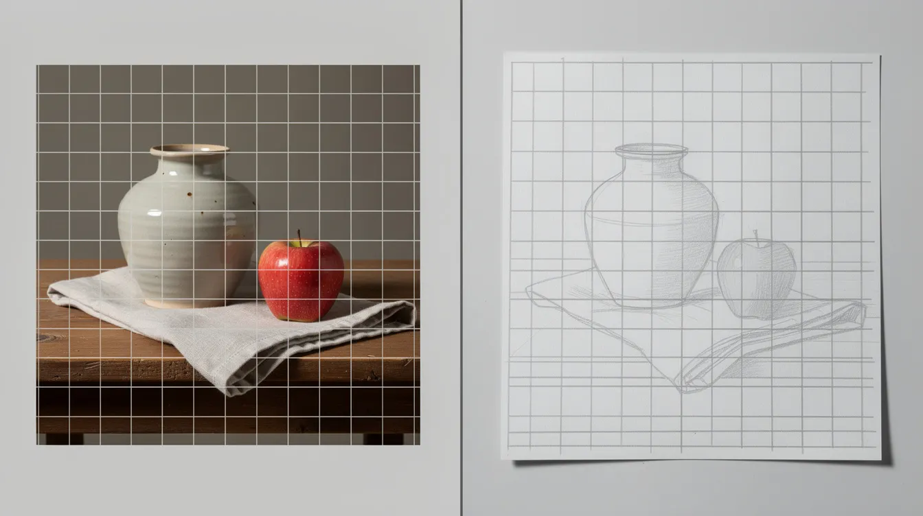
These methods improve speed and accuracy when you need a specific likeness or when working on a large, complex piece. Grid methods are used to improve accuracy in drawing from photographs, and they’ve been used by artists for centuries.
Grid method, step by step:
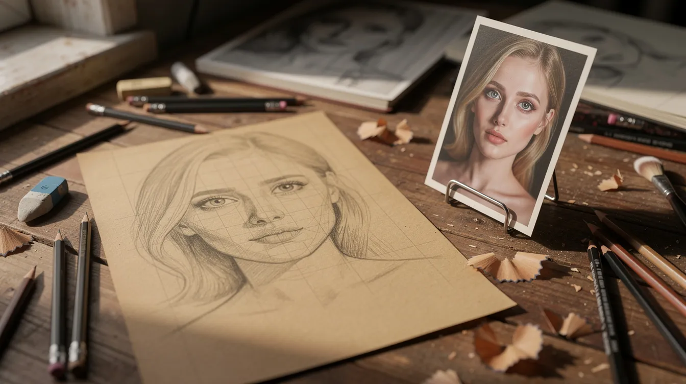
- Print or display your reference photo and overlay a grid (1 cm squares work well). You can draw the grid on a clear acetate sheet or use a digital overlay.
- Draw a proportional grid on your paper. For a 2× enlargement, use 2 cm squares.
- Copy what you see square by square, focusing on where lines cross grid intersections.
The trade-off: grids can encourage copying per square without seeing the overall gesture. Use them for layout, then erase the grid and draw freely.
Light board tracing: Place the printed photo and your drawing paper on a light box. Trace key contours and landmarks gently. But don’t stop there. Redraw and refine forms with your own understanding. A traced outline is just scaffolding.
Projectors and digital tablets: For murals or large canvases, projecting a small photo lets you set basic placement quickly. On a tablet, trace a rough underdrawing on one layer, then switch to a new layer and redraw with real structure.
A recent study with medical students found that tracing-based methods significantly improved proportional accuracy and structural completeness compared to memory-based drawing – an improvement of roughly 12 points on drawing assessments. But the researchers also noted that tracing should be balanced with active, freehand practice. These methods save time for commissions, but for skill-building, your eye needs the challenge of working without the safety net.
From Simple Study to Hyper Realistic Drawing: Choosing the Right Level of Detail
Ask yourself before every drawing: what is the goal here? A quick study? A loose sketch to capture the idea? Or a polished hyper realistic drawing that closely echoes the reference photo?
More detail is not always better. For learning structure and light, a simplified study with big value shapes and minimal texture often teaches more than weeks of rendering individual pores and hairs. Hyper-realistic copies from photos may lack artistic value if they don’t demonstrate any understanding beyond copying. Drawing from photos can lead to stiff and unnatural results when every tiny detail is reproduced without thought.
Tiered practice works best:
- 10–20 minute small studies to capture gesture and basic light.
- 1–2 hour finished studies focusing on value and edges.
- Occasional longer projects where you push detail intentionally and mindfully.
If you choose hyper realism, do it right, especially when working with media like colored pencils and aiming for professional-level colored pencil techniques:
- Work from a high-quality reference photo with excellent lighting.
- Block in the entire value structure lightly before diving into micro-textures.
- Step back often. Compare the overall effect at a distance, not just the area under your pencil.
A strong drawing can look better than the reference photo because you simplify distractions, correct distortions, and discover the essential forms that the camera missed. That’s the difference between an artist and a photocopier.
Integrating Photo References Into a Healthy Drawing Practice
Photographs are powerful tools when chosen thoughtfully, lit clearly, and used to support your understanding of form, light, and composition. Many artists around the world use photos for reference but emphasize drawing from life – and that balance is what creates real progress.
Build a routine that includes both:
- Some life drawing each week: your hands, objects on your desk, quick self-portraits in a mirror. Drawing from life requires patience and regular practice, but it pays off. Balancing photo references with life drawing develops stronger skills than either approach alone, and a structured course can help learners maintain that balance.
- Photo reference for complex subjects, long-term projects, or when consistent lighting is crucial.
You are not competing with the camera. Your role as an artist is to interpret, clarify, and express across different styles, whether you’re creating a still life, a pet portrait, or a bustling street scene from your imagination.
Here’s your challenge: Choose one object you can observe in real life: a plant, a mug, a shoe. Photograph it under good light. Then create two drawings: one from life, one from the photo. Compare what each teaches you. That single exercise will show you exactly how photographs fit into your art practice, and where your own eyes still have the edge.
Every thoughtful drawing from a photograph, approached with curiosity and effort, is a step toward a deeper skill and a more personal artistic voice. Now go draw something.