When you love color, it is tempting to jump straight into choosing the perfect hue. But the real structure of every convincing drawing lives in something quieter: value.
What Are “Values of Colours” and Why Do They Matter?
Value is defined as the relative lightness or darkness of a color, and it matters more for realism than the hue you pick. If your values are accurate, your drawing will look three-dimensional whether the viewer sees it in full color or in a black and white version.
Think of it this way. Accurate values create believable light, depth, and form. A sphere looks round because of a smooth value gradient from highlight to core shadow. A face has planes that catch sunlight differently. When values are off, even the most beautiful hue choices will look flat, because the human eye reads lightness and darkness before it reads color. Value contrast separates objects in space and defines form, which is why a grayscale photo of a strong drawing still makes complete sense.
Here is something that surprises most people: two colors of the same hue can sit in completely different places on the value scale. A pale mint green and a deep forest green are both “green,” yet one is close to white and the other is close to black. Beginners misjudge value far more than they misjudge hue or saturation. In my courses at It’s Easy To Draw, I train students to see value first, color second, because value carries the structure of the picture. I use a value scale drawn in colored pencil plus a grayscale check, so colors read correctly and drawings stay three-dimensional.
What Are Hue, Value, and Saturation in Color Theory?
Color theory organizes every color you see into three dimensions. Hue refers to pure spectrum colors like red and blue. It is simply the color family name. Many different values and levels of saturation can share the same hue: a pale sky blue, a rich cobalt, and a near-black navy are all “blue.”
Value measures how light or dark a color is, independent of its hue. Pure white and pure black mark the ends of the value scale, with every color falling somewhere between. Saturation indicates a color’s intensity or purity. A bright lime green and a dull olive might share a similar value, yet they feel completely different because saturation separates them. A tint is a hue with white added to it, a shade is a hue with black added to it, and a tone is a hue with gray added, reducing saturation. A shade of a color can significantly alter its emotional meaning, shifting a cheerful red into something brooding and heavy. Mixing colors can also desaturate hues using gray or complements, pushing them toward neutral territory.
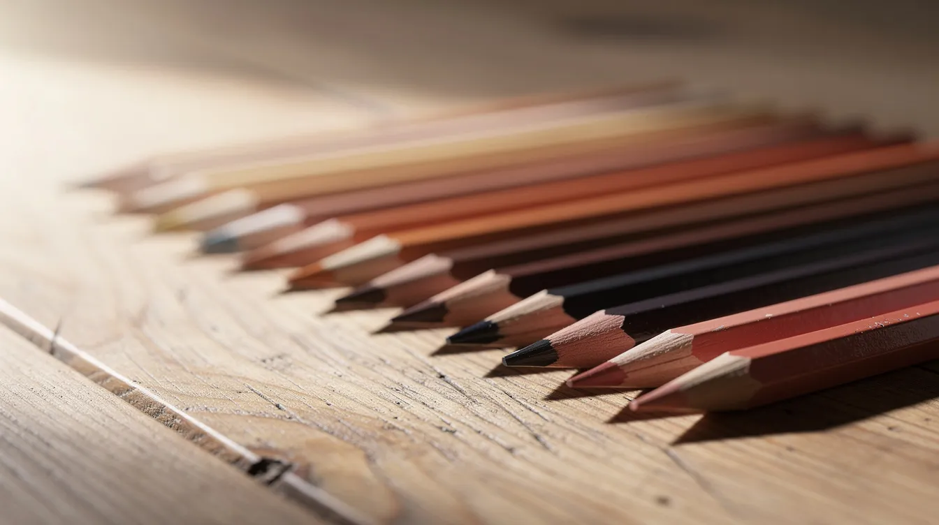
In painting and colored pencil work, hue, value, and saturation interact constantly, but value is what most strongly affects readability and realism. Even oil painters who work with vivid palettes know this. When I teach adult beginners, we often work with limited palettes or grayscale first to separate value decisions from color excitement. Students assume a color’s name tells them how dark it is. They think purple must be dark and yellow must be light. I have them swatch their pencils and compare the swatches in grayscale, and they are usually surprised at how light some purples are and how dark a desaturated orange can become.
How Does the Value Scale Work, from White to Black and Everything Between?
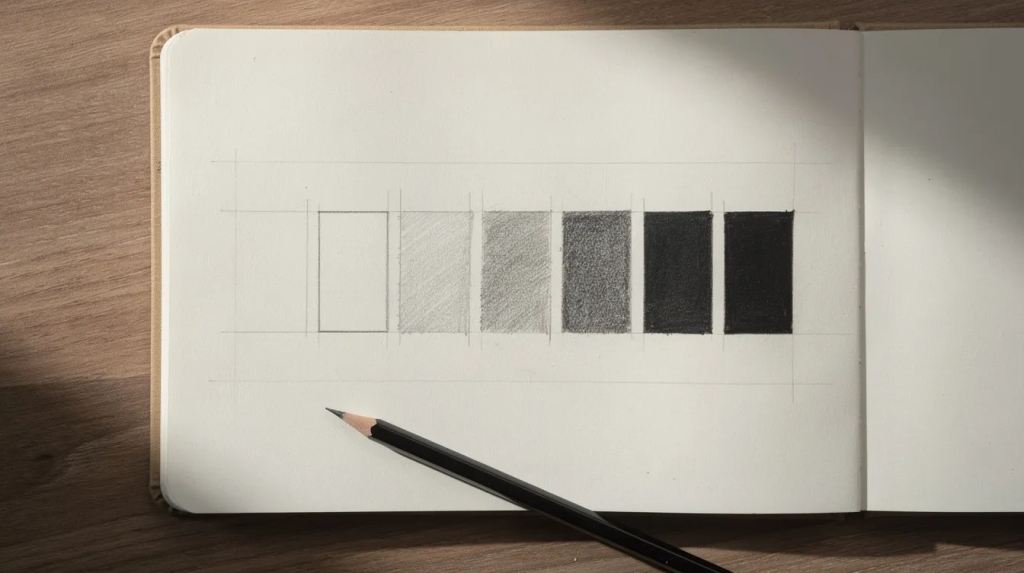
A value scale is a strip or chart divided into steps that move from white through progressively darker greys to black. Each step represents an equal visual increment of lightness or darkness. The Munsell Color System ranges from 0 to 10 for value, with 0 being black and 10 being white. Many artists use a 1 to 9 or 0 to 10 scale depending on their preference.
An odd number of steps, like nine, is especially helpful because it gives you a true middle grey as a benchmark. That middle square lets you determine whether an area in your drawing is lighter or darker than center. Imagine a row of nine boxes in your sketchbook: box one is your lightest mark, barely touching the paper, and box nine is your heaviest, most layered tone approaching black. You can make this with pencil, markers, or digital tools. I have my colored pencil students build their scale using one pencil and steady pressure changes. Their first attempt usually jumps too quickly from light to dark, so I have them redo it until the steps look even. Try drawing your own before reading further.
Why Is Seeing Colour as Value So Difficult?
Struggling to see values accurately is completely normal and not a sign of lack of talent. Most art classes rush through this, so adult learners often arrive at my courses without a solid value foundation.
Our brains store “symbol” ideas. A banana is yellow. Grass is green. A single leaf in nature can contain several hues and values, yet we label it “green,” which hides its true value pattern. Color psychology studies how colors influence human emotions and behavior, and those associations run deep. Red evokes feelings of energy and passion, and is associated with high arousal and urgency, stimulating both passion and danger. Yellow is associated with optimism and modernity. Green suggests nature and stability but can imply decay. Blue conveys coolness and spirituality but can suggest sadness. Violet represents fantasy and playfulness but can imply madness. Pink conveys tenderness, love, and emotional warmth, often associated with compassion. Black represents sophistication, authority, and can evoke emotions of grief. White symbolizes purity and cleanliness but is associated with mourning in some cultures. Color symbolism can represent opposite ideas in different cultures, such as white for purity or mourning. Neutral colors like black, white, gray, and brown convey simplicity and stability. Warm colors like red, orange, and yellow are linked to energy and excitement, while cool colors like blue and green are typically associated with calmness and reflection. A systematic review found consistent emotional associations with colors across cultures, yet color meanings vary widely across different cultures and historical contexts, always influenced by the viewer’s cultural background and context.
All of this emotional knowledge makes it harder to see what is actually in front of you: the raw difference between light and dark. Intense high-chroma colors trick the eye into feeling lighter or darker than they really measure on the value scale. And surrounding colors shift perception further. A mid-value color can look much lighter against a dark background and much darker against a light one. In class, when students color a leaf in one flat green, I have them squint and name the lightest, middle, and darkest area before they pick up a pencil. Squinting helps artists see tonal value more clearly by removing detail and isolating the big shapes of light and shadow.
Practical Tools: Grayscale, Same Hue Comparisons, and the Black and White Version Test
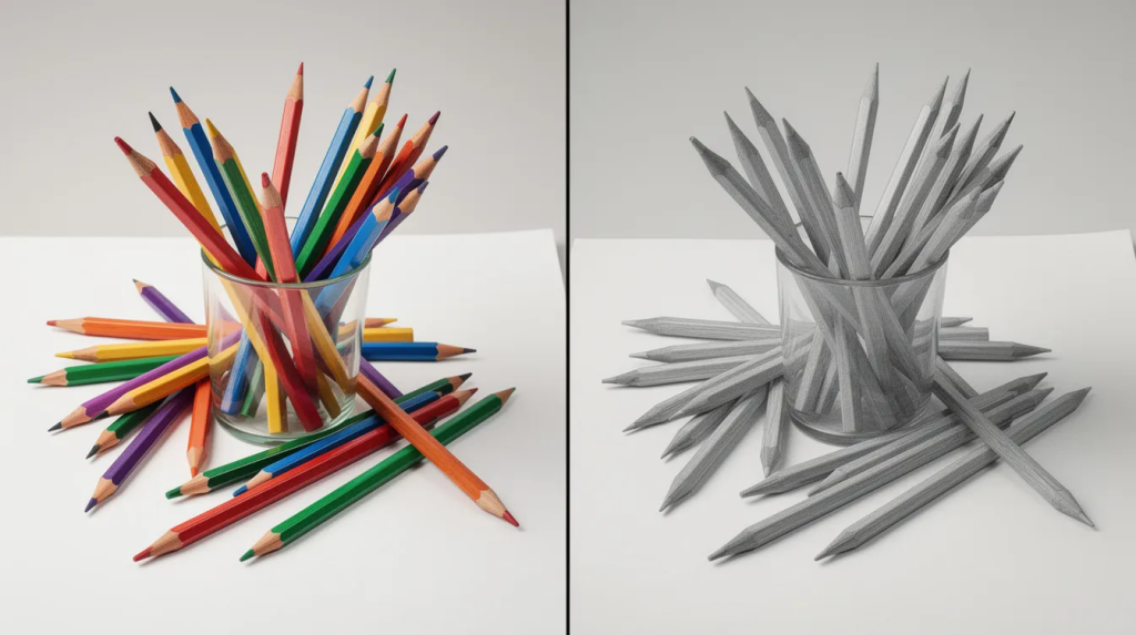
Converting a photo of your artwork to a black and white version is the fastest way to reveal your true value structure. On your phone, take a picture and drop the saturation to zero. You cannot hide weak shadows or muddy midtones when color is gone.
You can also hold a printed grayscale card or value scale next to an area of your drawing and squint to judge which step it matches. For comparing colors of the same hue, line up several blues and notice which are lighter, darker, or equal in value. For example, ultramarine blue sits much darker on the scale than cerulean blue, even though both are “blue.” Phthalo blue falls somewhere between them. That comparison helps you choose the correct pencil for a given spot. Using a gray cardboard with a hole punched in it helps isolate color perception by removing surrounding context so you can see a color’s actual value without the background fooling your eye.
I have my colored pencil students take a grayscale phone photo after every few layers, not just at the end. Their common mistake is trusting their eyes after an hour of work, when the image has quietly gone flat.
Which Step-by-Step Exercises Train Your Eye for Accurate Values?
These are structured drills I use with my It’s Easy To Draw students, and they work beautifully for beginners or rusty intermediates.
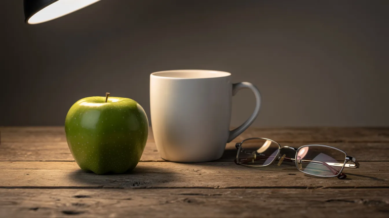
Start with a three-value study. Choose a small natural object under a lamp and shade it with only light, mid, and dark values, ignoring color entirely. Focus on where each value falls on the subject. Next, try a swatch exercise: color swatches of red, orange, yellow, green, blue, and purples, take a photo, convert it to grayscale, and compare their values. Then try to blend or layer a blue so that in grayscale it matches a mid-grey swatch on your value scale. For a more structured drill, pick a reference photo, block it in like a paint-by-numbers of only five values with hard edges between each zone, then refine later. Even 15 minutes a day of limited-value studies for a few weeks can dramatically sharpen your value judgment.
How Do You Use Value to Build Convincing Light, Form, and Depth?
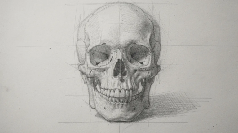
Value patterns make a sphere look round, a face look three-dimensional, and a composition feel deep. The idea is to group similar values into larger, simpler shapes before adding detail. When drawing a portrait, I start by mapping big shadow shapes around the eyes, nose, and jaw with a single dark value. Step by Step Drawing a Realistic Human Skull is a great exercise for this, because the skull has strong structure that rewards clear value grouping.
Value contrast guides the viewer’s eye. The strongest light-to-dark contrast in your picture becomes the focal point, even if the hue there is quiet. If values are too similar everywhere, the result looks muddy or flat, even when the colors themselves are bright. Connect this back to the black and white version test: if your piece reads clearly in grayscale, the light and form are doing their job. When a student tells me their drawing looks flat, the fix is rarely a new color. I have them darken the darkest darks, keep the lights clean, then check the grayscale again. That single adjustment often transforms the sense of life in the work.
How Do You Apply Values of Colours with Real Art Materials?
Knowing the theory is wonderful, but you need to taste how different materials respond. Graphite, ink, colored pencils, watercolor, and gouache each handle value differently. Colored Pencil Techniques covers the bigger picture of how value fits with layering, pressure, and blending.
For graphite and charcoal, start every new subject as a quick value study before adding any color. For colored pencils, build value by layering the same hue, adjusting pressure and pencil choice instead of immediately grabbing a darker color family. How To Color Gemstones With Colored Pencils is a practical example of using strong value contrast between darks and bright highlights to create the illusion of glassy, three-dimensional form in most colors. For watercolor or gouache, control value through water-to-paint ratio, testing swatches and holding them next to a printed value scale to match each step accurately. In my courses like The Fundamentals of Drawing and How to Use Colored Pencils Like a Pro, we isolate value skills before complex color work. I encourage every student to keep one “value-only” sketchbook where they regularly practice scenes in grayscale to support all future color work.
Next Steps: Building Confident Colour Through Strong Values
Mastering values of colours is the single biggest leap many adult students make toward professional-looking art. Seeing values accurately is a trained skill, not an inborn gift. Consistent small studies are more effective than rare long sessions.
Try this simple weekly routine: one value scale refresh, one black and white version check of a colored piece, and one three-value study from life using natural objects. How To Use Colored Pencils Like A Pro is your natural next step for applying values in colored pencil with guidance and critique. I would love for you to continue learning value and color theory with me through structured courses and community critique at It’s Easy To Draw. When your values are right, you can be far more playful and expressive with your color choices without losing realism. Values are your scaffolding. Once they work, everything else is free to dance.
FAQ
What is value in colored pencil drawing? Value is how light or dark a color is, separate from its hue. It is the main thing that makes a drawing look three-dimensional rather than flat.
How do you check the values of colours in a drawing? Take a photo and convert it to black and white, or hold a grayscale card next to an area and squint to see which grey step it matches.
How do you make a value scale with colored pencils? Draw a row of nine boxes and use one pencil with steady pressure changes to move from nearly white to nearly black in even steps.
Why does my colored pencil drawing look flat? Usually the values are too close together. Darken the darks, keep the lights clean, and re-check in grayscale to spot where contrast is missing.
Which colours are naturally lightest and darkest in value? Yellow is usually the lightest and blues and purples tend to be the darkest, but always check each pencil against a grayscale card because individual pigments vary.
How many values should you use in a drawing? Start with three or five values to get the big shapes right, then add more steps as you refine detail and transitions.