
Realism in Drawing: From First Outline to Finished Artwork
From first outline to finished artwork. The 5 core steps of a realistic drawing process, plus the observation skills that bring it together.
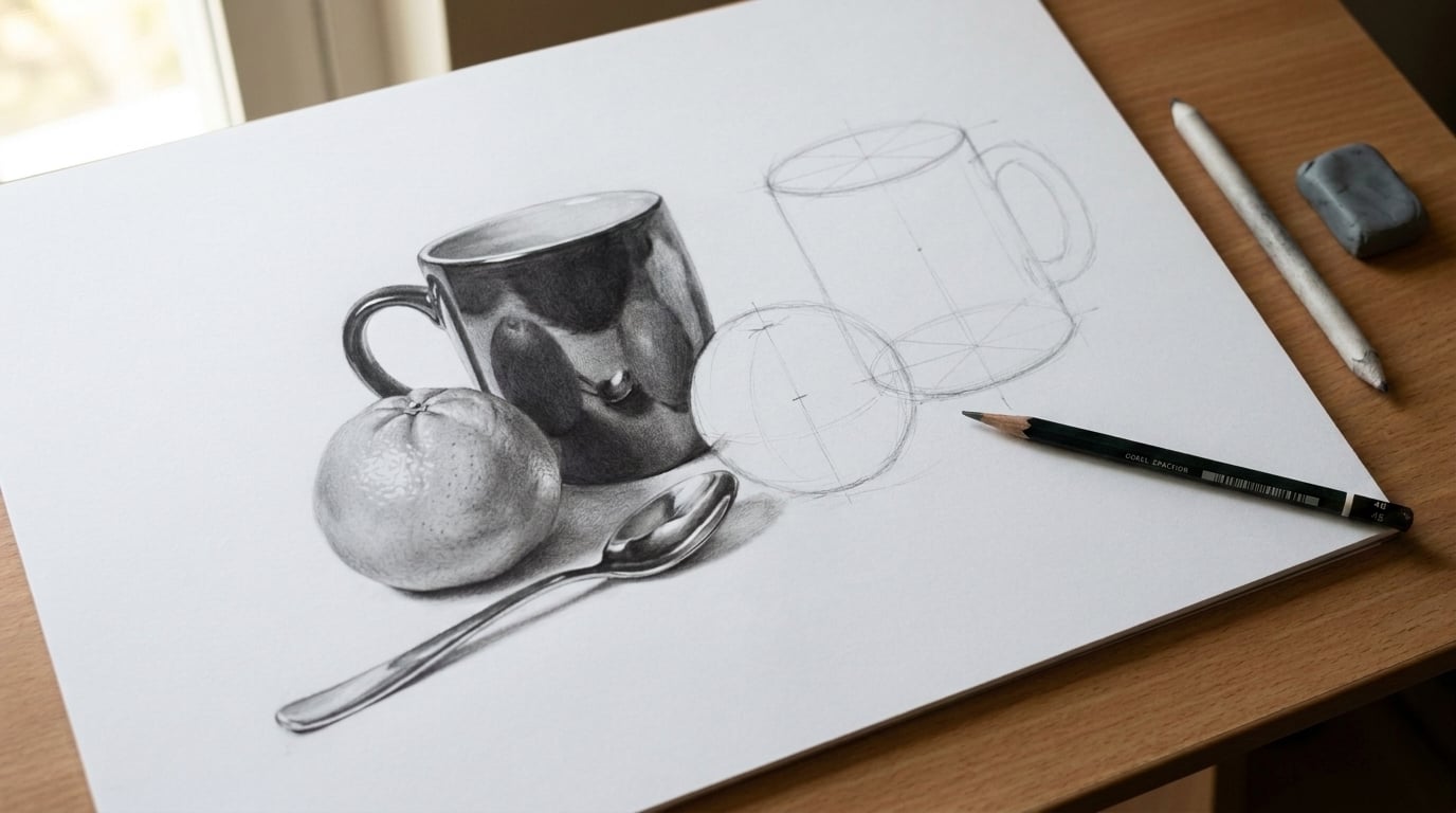
Introduction: What Realistic Drawing Actually Means
So you want to draw realistically, do you? Maybe you’ve seen those jaw-dropping graphite portraits online and thought, “How do they do that?” Here’s the thing most beginners don’t realize: realism in drawing is the practice of depicting subjects exactly as they appear in the physical world without idealization or exaggeration. It’s not about copying a photo pixel by pixel or tracing every tiny detail until your eyes cross.
Realistic drawing means creating convincing light, form, and texture that make a flat surface feel three-dimensional. Unlike stylized art, which simplifies, exaggerates, or distorts features to convey personality or a specific aesthetic, realism avoids these distortions for faithful representation. It shows flaws, wrinkles, and blemishes exactly as they are.
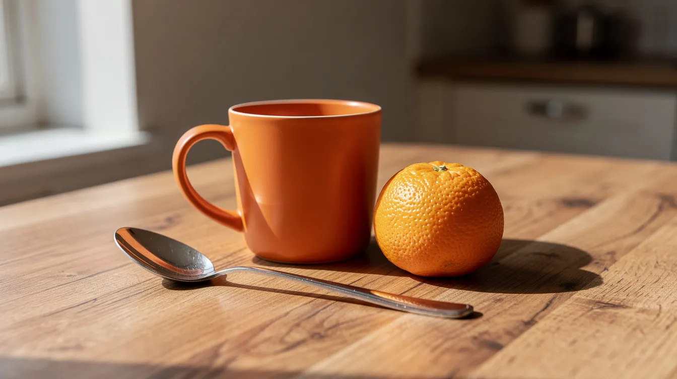
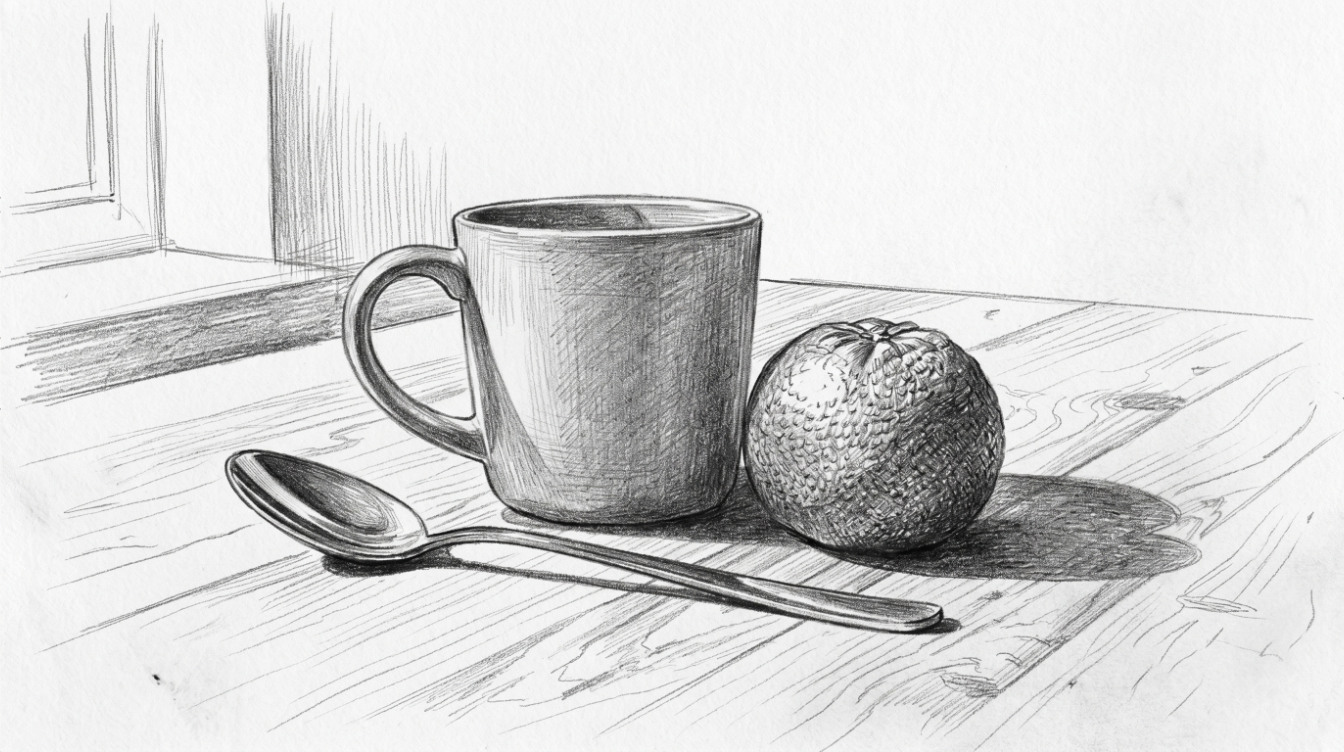
At It’s Easy To Draw, we focus on building these skills step by step through structured online courses and community support. Throughout this post, I’ll use a concrete example: a realistic graphite drawing of a still life featuring a ceramic mug, an orange, and a metal spoon on a kitchen table. We’ll cover the drawing process, essential drawing techniques, working from a reference photo, and choosing tools like graphite pencils. Let’s get into it.
The 5 Core Steps of a Realistic Drawing Process
Here’s a secret that will save you hours of frustration: a clear, repeatable drawing process reduces overwhelm for beginners. When you know exactly what comes next, you stop second-guessing yourself and start actually drawing.
The five stages are:
- Planning – Designing your composition before starting to draw is crucial for achieving a successful artwork, as it allows you to decide on the major elements and their placement in the piece
- Block-in – Establishing the main shapes and proportions lightly on paper
- Refining proportions – Adjusting angles, relationships, and edges before committing to dark marks
- Building values – Layering lights, midtones, and darks to create depth
- Final details and adjustments – Adding texture, cleaning edges, and knowing when to stop
For our mug-orange-spoon still life, this means first deciding where each object sits on the page, then sketching their basic shapes, checking that the spoon isn’t too long relative to the mug, shading from light to dark, and finally adding the orange’s peel texture and the spoon’s reflections.
Following the same sequence on every piece builds confidence and speed, regardless of subject. This framework mirrors how we teach in “The Fundamentals of Drawing” inside It’s Easy To Draw.
Step-by-Step Realistic Drawing Tutorial (Still Life Example)
You came here for practical instruction you can follow today, so let’s deliver. This tutorial uses a high-resolution reference photo shot in natural window light. Our subjects are the ceramic mug, orange, spoon, and folded cloth on a wooden table.
Each sub-step focuses on one simple task: outline, lights, midtones, darks, and blending/texture. Set aside 60 to 90 minutes and work slowly, pausing between steps to compare with your reference photo. Ready?
Step 1: Create an Accurate Outline
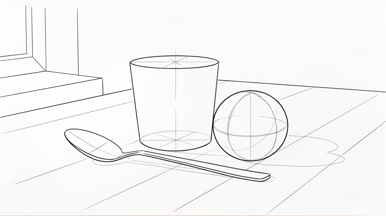
Proportional accuracy matters more than tiny details at this stage. When drawing, it is important to focus on getting the larger shapes and proportions correct before adding details, as this helps maintain overall accuracy in the artwork.
Grab a light HB pencil and smooth drawing paper (A4 or 9×12 inch works perfectly). Lightly block in the main shapes first: the mug as an oval and cylinder, the orange as a sphere, the spoon as a simple long shape, and the table edge as straight perspective lines.
Using a grid or tracing can help artists accurately block in shapes and maintain proportions in their compositions, which is essential for realistic drawing. Try a simple 4×5 grid on both your printed reference photo and your drawing paper. This visual guide helps beginners transfer angles and distances without guesswork. To improve drawing accuracy, artists can use techniques such as triangulating points to block in shapes and maintain proportions.
Keep all lines light and erasable. Avoid details like the mug handle’s inner curves or spoon reflections at this stage. When designing a composition, it is important to consider the overall balance and harmony of the elements, ensuring that no part of the drawing feels out of place or overly dominant.
Step 2: Map Highlights and Light Areas
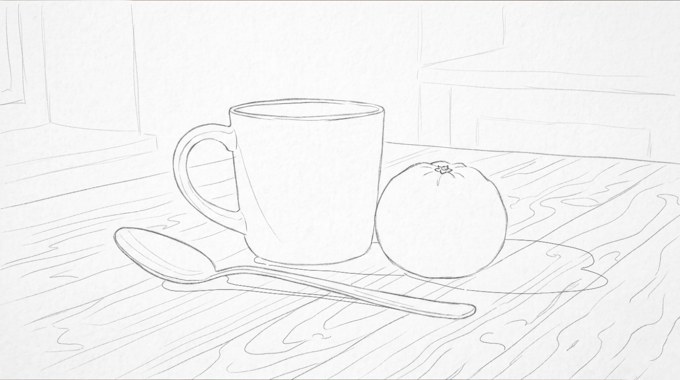
Planning light shapes early makes shading far more controlled. The grayscale version of your reference photo shows three main value groups: highlights, midtones, and shadows. A typical value scale includes highlights, midtones, and shadows, which can simplify the creation of depth and realism in artwork.
Lightly outline highlight shapes on the mug’s glossy surface, the brightest area on the orange where light hits directly, and the light reflections on the metal spoon. Leave these zones completely white. Don’t shade them at all in early layers.
A common technique to avoid misjudging light and dark values in drawing is to squint at the subject, which helps reduce visual information and clarify contrasts. Squint at your reference to simplify what you see into big light shapes instead of details. Trust this process.
Step 3: Shade the Midtone Values
Midtones are the “average” light on most of the objects: neither the brightest highlights nor the deepest shadows. This is where your drawing starts to feel real.
Switch to a 2B graphite pencil with light to medium pressure. Lay down even midtone shading on the mug, orange, and table top. Use consistent hatching or light circular strokes, following the form (around the orange’s curve, around the mug’s cylindrical body) rather than random scribbles. This sense of direction in your marks helps convey three-dimensional form.
Work around the highlight shapes you preserved in Step 2. Your drawing will look flat at this point. That’s completely normal. Resist the urge to skip ahead.
Step 4: Add Dark Shadows and Deepen Contrast
Increasing contrast is what makes a drawing feel truly realistic. In realism, artists achieve accuracy by prioritizing accurate value scaling, blending, precise proportions, and observing edges.
Switch to a softer 4B or 6B graphite pencil for cast shadows under the mug and orange, the darkest side of the mug, and the spoon’s deepest reflections. Compare the darkest darks on the reference photo to everything else. Push your values far enough; most beginners keep shadows too light.
In photorealism, distinct outlines do not exist. Forms are defined by changing values, with hard edges for sharp shadows and soft edges for shadows that blend into light. Refine edges between objects and shadows, such as the crisp edge where the orange meets the table. Work slowly, stepping back periodically to check that values read correctly from a distance.
Step 5: Blend, Refine Edges, and Add Texture
Now we polish the drawing without over-blending it into a smudgy mess.
Use a blending stump or tissue to gently soften transitions on the mug and in the background, leaving the orange’s texture a bit rougher. Each surface has a different material quality: the ceramic mug has a slight sheen, while the orange peel is matte and textured.
Use a kneaded eraser to pull out tiny highlights: small reflective dots on the spoon’s surface and subtle light on the mug’s rim. Micro-details like skin pores, freckles, or stray hairs add instant believability to a realistic drawing. Here, that means the orange’s pores, faint grain lines on the wooden table, and the ceramic sheen.
When is the drawing finished? When adding more doesn’t improve it. Step back, squint, and if everything reads well from arm’s length, you’re done.
The Key to Realistic Drawing: Values and Light
“Value” means how light or dark something appears, independent of color. Proper use of values is the most effective way to express a subject realistically, as values represent the range of light and dark in a drawing.
Here’s a fact that might surprise you: roughly 80% of realism comes from achieving the correct brightness value for each shape, rather than exact colors. Realistic drawing relies more on correct values than on perfect line work or fancy drawing technique.
Look at our still-life: the bright highlight on the orange versus the deep shadow under the mug creates the illusion of depth. Realism relies on a deep understanding of perspective, proportion, light, shadow, and texture to create a lifelike illusion on a two-dimensional surface.
Using tools like value study apps or traditional gray scale value finders can help artists identify and apply tonal values more effectively in their work. Try converting your reference photo to grayscale to study value patterns.
A simple daily exercise: spend 5 minutes creating value scales and tiny 3-value studies (light, mid, dark) of everyday objects like a coffee cup, ceramic bowl, or your phone. Learning guides are available for tutorials on matching brightness values to see value scaling and blending in action.
Drawing What You See (Not What You Think You Know)
The most basic skill of drawing is to notice how things actually look, rather than how you think they should look, which is essential for creating accurate representations. Beginners often fall into “symbol drawing,” sketching what they know (a round eye shape, a rectangular phone) instead of what they actually observe.
Watch carefully: a round plate appears as a skinny ellipse from an angle. A laptop keyboard’s keys get smaller as they recede in perspective. Drawing realistic objects requires understanding perspective, which involves using vanishing points to accurately depict how objects recede into the distance.
Practice constantly comparing angles, lengths, and shapes on the page to what is actually visible in the reference photo. Hold your pencil at arm’s length to measure angles and tilt, then match that angle on the paper. This simple tip transforms accuracy.
This mindset connects to It’s Easy To Draw’s fundamentals lessons, where students regularly practice seeing and simplifying real objects before committing to detail.
Choosing the Right Tools: Graphite Pencils, Paper, and References
You don’t need expensive tools to begin. Basic graphite pencils from any art store will serve you well for months of practice.
Graphite pencil grades:
| Grade | Use |
|---|---|
| HB | Light sketching, outlines, initial block-in |
| 2B | Midtones, general shading |
| 4B | Darker shadows, building depth |
| 6B | Deepest darks, rich blacks |
Paper types for realistic drawing:
- Smooth Bristol: ideal for detailed, polished work
- Medium cartridge paper: good all-around choice with some tooth
- Heavier drawing paper (80+ lb): prevents buckling from erasing and blending
Why does paper surface matter? Smoother paper lets you achieve fine detail and controlled blending. More tooth creates texture effects but can make it harder to blend smoothly.
The more realistic you want your artwork to be, the better your reference photos must be, as great work starts with great reference photos. Look for strong single light sources, clear shadows, and visible texture. Members in the It’s Easy to Draw Academy get a new pack of reference photos from Lisa every month.
How to Work with a Reference Photo Effectively
Staying loyal to the reference is crucial for realistic drawing, especially for beginners. Using reference photos allows artists to draw what they see rather than what they think should be there, which is crucial for achieving realism in artwork.
Keep the reference large and clear: either printed at about A4 size or displayed on a tablet with brightness turned down slightly to reduce eye strain. Reference photos should have good lighting, clear details, and show as much detail as needed to complete your work effectively.
Spend as much time looking at the reference as at your drawing. Mentally ask “what is really here?” before each stroke. Mark key landmarks on both reference and drawing (edges of objects, darkest shadow, brightest highlight) before heavy shading.
Use reference photos as learning tools rather than something to copy mechanically. Small artistic adjustments to composition or background are perfectly acceptable once you understand the fundamentals.
From Graphite to Color: Building on Realistic Drawing Skills
Strong realistic drawing in graphite pencils is the foundation for colored pencil and mixed-media work. Every skill you’ve practiced (values, edges, form, texture) transfers directly to color.
Understanding value and light makes it easier to choose correct colors and layering when moving into colored pencils. Imagine starting with a graphite study of a glass jar, then creating a colored pencil version that adds color temperature and reflection details. The visual structure remains the same; you’re just adding another layer of information.
At It’s Easy To Draw, many courses pair grayscale drawing studies with full-color projects to reinforce this connection. Students often say their colored work improved dramatically after spending time in graphite.
Explore structured paths: beginning with fundamentals and grayscale in “Fundamentals of Drawing,” then advancing to “How to Use Colored Pencils Like a Pro” for realistic color rendering. The skills compound beautifully.
Practice Plans, Mindset, and Next Steps with It’s Easy To Draw
Realistic drawing is a learnable skill, not a talent you’re born with. Every artist you admire spent years putting in the effort.
Simple 30-day practice plan:
- Days 1 to 10: Draw small objects from a reference photo (10 to 20 minutes daily), focusing on value only
- Days 11 to 20: Add proportion accuracy exercises, using grids or measurement
- Days 21 to 30: Complete two full still-life drawings, applying all five steps
Keep your early drawings. Note what improved. Accept “failed” drawings as necessary steps. Every mistake teaches you something.
Joining the It’s Easy To Draw community (courses, Discord, Reddit) gives you access to feedback, critiques, and accountability for your realistic drawing goals. Other things like posting your work publicly create gentle pressure to practice consistently.
Your next step: Sign up for a free account, download a starter realistic drawing project, and share your first graphite still life with the community. The creation of artwork that feels real and alive is closer than you think. You just have to start.