
Color Theory for Artists
Color that actually works. The wheel, relationships, and mixing rules that beginners can use today, without art-school jargon.
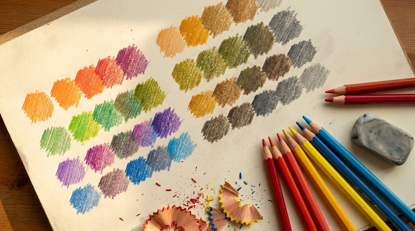
You’re staring at a portrait you just finished in colored pencils. The skin tones look muddy, the shadows are lifeless, and something about the whole piece feels off. Sound familiar? The culprit is almost always the same: a shaky understanding of color theory.
Color theory helps artists understand how colors work together and influence perception, allowing for intentional color choices that can evoke specific emotions or create visual harmony. Whether you’re working with colored pencils, watercolor, or soft pastels, mastering these principles transforms guesswork into confident decision-making.
Here at It’s Easy To Draw, we see this transformation happen every day. Adult beginners who once struggled with flat-looking landscapes suddenly create depth and atmosphere. Portrait artists fix those dreaded muddy skin tones simply by understanding warm and cool relationships. By the end of this guide, you’ll be able to build a simple color palette, choose a color scheme that works, and avoid the most common beginner mistakes.
We’ll cover the essential building blocks: the color wheel, color harmony, color temperature, and color relationships. These aren’t abstract concepts; they’re practical tools you can apply to your very next piece.
Basic Color Theory: The Building Blocks
Basic color theory is the study of how colors mix, match, and interact in art. Colors have three distinct attributes: hue, value, and saturation. Understanding these three properties gives you control over every color decision you make.
Hue refers to the color family itself, such as cadmium red versus ultramarine blue versus lemon yellow. Value indicates how light or dark a color is and is crucial for making a painting look realistic. Without proper value contrast, even the most vibrant hues fall flat. Saturation, or chroma, is the intensity or purity of a color, where highly saturated colors pop forward and desaturated colors recede into the background.
Primary colors are red, blue, and yellow, which cannot be created by mixing other colors, while secondary colors are green, orange, and purple, formed by mixing two primary colors. When you mix a primary with its neighboring secondary, you get tertiary colors like yellow orange, red orange, blue green, yellow green, red violet, and blue purple.
Understanding tints, shades, and tones gives you even more control. A tint is your base color plus white. Think of it like how you get pink from red. A shade is hue plus black, like adding black pencil to ultramarine for a deep blue. A tone involves adding gray to your hue, which reduces saturation without dramatically changing value. These modifications let you create harmony across light and shadow in any artwork.
The Color Wheel and Color Relationships
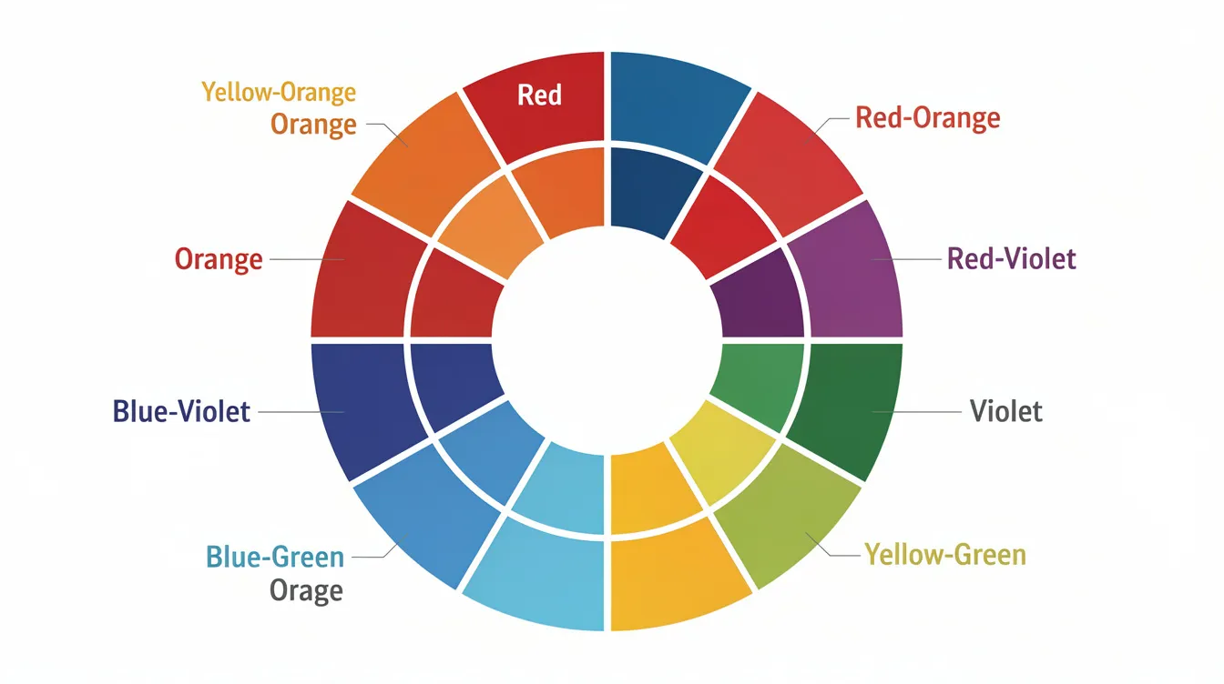
The first color wheel was developed by Sir Isaac Newton in the 17th century, arranging red, orange, yellow, green, blue, indigo, and violet on a rotating disk. Today’s artist’s color wheel builds on that foundation using the red-yellow-blue model that painters and colored pencil artists rely on daily.
The color wheel is divided into 12 segments, featuring three primary colors (red, blue, yellow), three secondary colors (green, orange, purple), and six tertiary colors. The color wheel serves as a visual representation of color relationships, helping artists identify complementary and analogous colors for their compositions.
These relationships become your planning tools:
| Relationship | Definition | Example |
|---|---|---|
| Complementary | Colors on opposite sides of the wheel | Blue and orange |
| Split-complementary | One color plus two adjacent to its complement | Blue with yellow-orange and red-orange |
| Analogous | Three to four neighboring colors | Yellow, yellow-green, green |
| Triadic | Three evenly spaced colors | Red, yellow, blue |
| Tetradic | Two complementary pairs | Blue-orange plus red-green |
A quick note on systems: painters and colored pencil artists typically use the RYB (red-yellow-blue) subtractive model rather than the RGB (red-green-blue) additive system used for screens. When you mix colors on a palette or layer them in colored pencils, you’re working with pigments that absorb light, a fundamentally different process than mixing light on a screen.
Color Harmony and Classic Color Schemes
Color harmony is the art of combining colors in ways that are pleasing to the eye and effective in design, creating visuals that feel balanced and cohesive. You don’t need to reinvent everything from scratch; for centuries artists have relied on established color schemes to create reliable harmony.
Monochromatic Color Schemes
Monochromatic schemes use one color plus its tints, shades, and tones. Picture a calm blue seascape at dusk rendered entirely in variations of ultramarine, or a warm sepia portrait created only with brown and white pencils.
These schemes are excellent training tools for beginner artists because they force attention to value and color temperature rather than hue variety. When you remove the distraction of multiple hues, you learn to see how light hits a surface and how the shadow side creates form.
Analogous Color Schemes
Analogous color schemes consist of colors that are next to each other on the color wheel, creating a harmonious and cohesive look, often used to evoke calmness in artwork. Think yellow, yellow-orange, and orange for an autumn forest, or blue, blue-green, and green for a tranquil seascape.
Analogous colors provide a sense of unity and cohesion, often resulting in harmonious and serene artworks. The key is choosing a dominant color for 60% of your composition, a supporting hue for 30%, and a small accent for visual interest.
Complementary and Split-Complementary Schemes
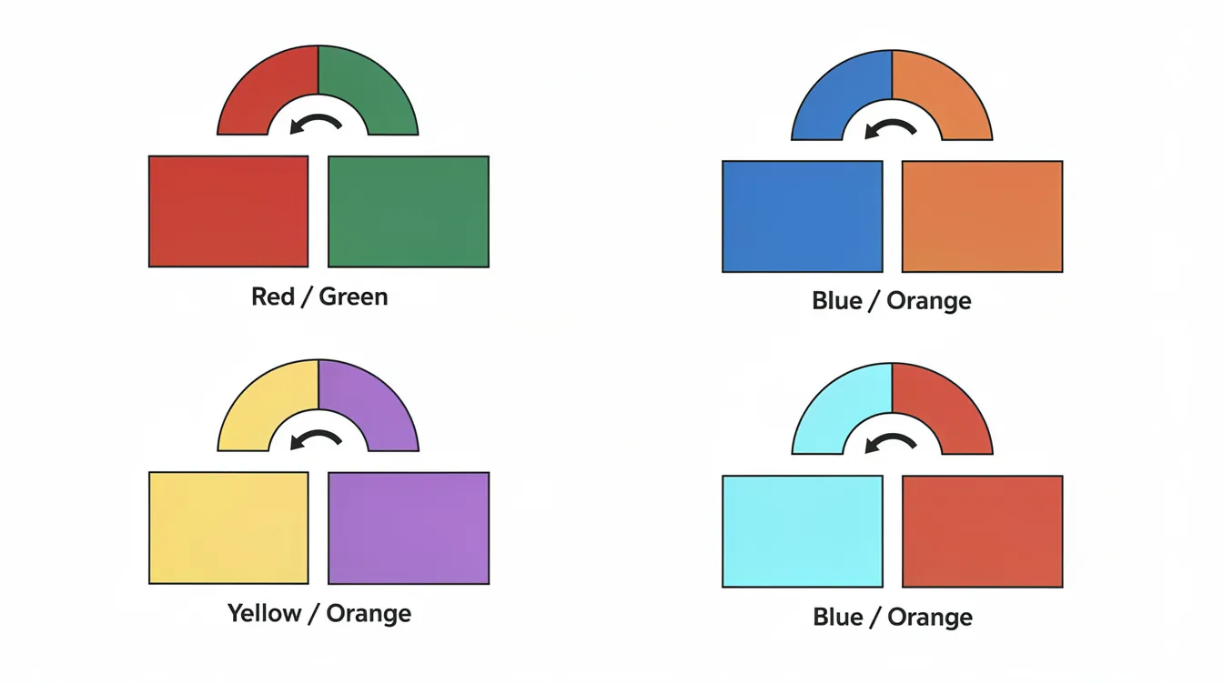
Complementary colors are opposite each other on the color wheel and create a strong contrast when placed next to each other, making them ideal for vibrant and dynamic compositions. Complementary colors create a dynamic interplay that draws attention and amplifies each other’s intensity, resulting in vibrant compositions.
The classic pairs (blue and orange, red and green, yellow and violet) deliver energy and drama. But here’s the pitfall: using complements at the same value and same saturation creates visual competition. You’ve seen the “Christmas color” cliché when red and green fight for attention equally.
Split-complementary schemes offer less contrast but more flexibility. Instead of blue and orange, try blue with yellow-orange and red-orange. You get the energy of contrasting colors without the intensity of direct complements.
Triadic and Tetradic Color Schemes
A triadic color scheme uses three colors that are evenly spaced around the color wheel, providing a vibrant and balanced palette that can be used effectively in various artistic projects. Red, yellow, and blue form the classic triad. Think children’s book illustrations with red characters, blue shadows, and yellow backgrounds.
Triadic color schemes offer a delicate balance between harmony and contrast, making them effective for vibrant compositions. The secret is treating one color as dominant, one as secondary, and one as a small accent color.
Tetradic color schemes use two complementary pairs, like blue-orange plus red-green. These provide the richest palettes but require careful control. Without clear dominance, tetradic schemes become chaotic. Treat two colors as subtle supporting tones and let one or two carry the composition.
Color Temperature: Warm vs Cool in Real Artwork
Colors evoke psychological responses and have temperatures that affect the mood and spatial depth of a piece. The warm colors (reds, oranges, yellows) occupy one half of the color wheel, while cool colors (blues, greens, blue-violets) fill the other.
Every hue has warm and cool versions. Cadmium red leans toward orange (warm version), while alizarin crimson leans toward violet (cooler). Ultramarine blue is warmer (leaning violet), while phthalo blue is cooler (leaning green). These biases matter enormously when you mix colors, because combining pigments with mismatched temperatures often introduces unexpected muddiness.
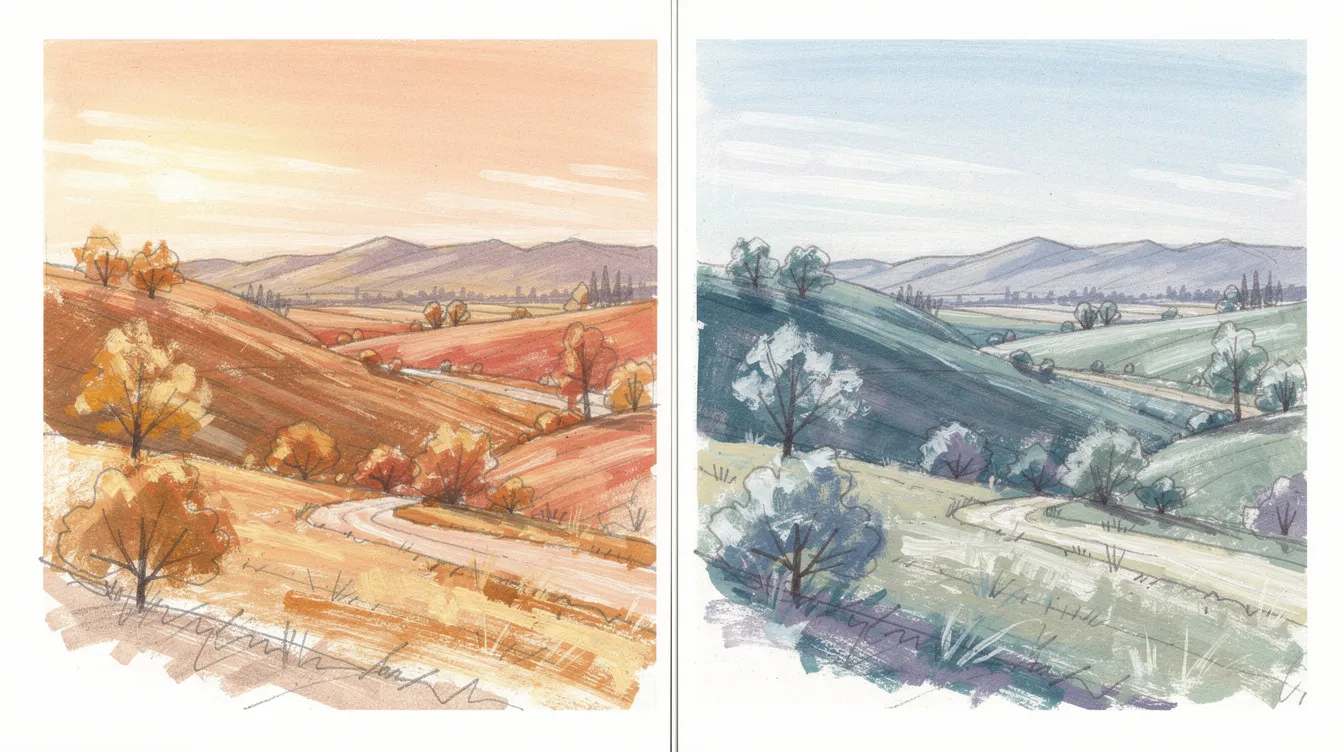
Warm colors tend to advance visually; cool colors recede. Landscape artists exploit this constantly: warm foreground trees against cooler distant mountains create depth without relying solely on size changes. Portrait artists use warm skin tones where light hits the face and cooler reflected light in shadows for realistic dimension.
In the It’s Easy To Draw community, colored pencil artists use warm and cool contrasts to create everything from luminous fur textures to glowing stained-glass effects. Understanding color temperature transforms flat artwork into pieces with real depth.
Practical Color Mixing for Traditional Media
Mixing on a palette, like watercolor, gouache, or acrylic, is immediate and physical. But in colored pencils and soft pastels, mixing happens through layering and optical blending. Small overlapping strokes, blending, and scumbling create your own colors directly on the paper.
The most powerful approach is building a limited primary palette with warm and cool versions of each primary. A warm yellow (cadmium) and cool yellow (lemon), warm red (cadmium) and cool red (alizarin), warm blue (ultramarine) and cool blue (phthalo) give you access to virtually any hue without muddy surprises.
Here’s a weekend project: create a color mixing chart using your six primaries. Mix each warm primary with each cool secondary option and document the results. You’ll quickly see which combinations produce vibrant secondary colors and which create muted tones.
Complementary mixing is your friend for sophisticated neutrals. Mix red and green together instead of reaching for black to darken a color. The result is a rich, natural gray or brown with more life than pure black ever provides.
For colored pencil artists specifically: layering order matters. Start with lighter colors, build gradually, and control pressure throughout. Heavy pressure early locks you out of adding more layers. Light, confident strokes throughout the process keep your options open and your color combinations clean.
Designing a Color Palette for Your Artwork
Before starting any piece, follow this simple workflow: choose the mood, pick a color scheme, select three to five main colors plus neutrals, then test swatches on scrap paper.
The 60-30-10 rule works beautifully in art: 60% dominant color, 30% secondary color, 10% accent color. Applying a single highly saturated color against a background of dull tones directs the viewer’s eye to the subject. Your accent color draws attention precisely where you want it.
| Palette Type | Color Scheme | Main Colors | Mood |
|---|---|---|---|
| Calm Ocean | Blue triad with grays | Ultramarine, cerulean, gray-blue | Peaceful |
| Fiery Fantasy | Analogous warm | Red, red-orange, orange, yellow | Energetic |
| Natural Earth | Split-complementary | Olive green, terra cotta, muted violet | Grounded |
Many artists now use digital color wheel apps to prototype palettes before committing to traditional media. There’s nothing wrong with planning digitally and executing traditionally; it saves pigment and time.
Create a personal palette library page in your sketchbook. Date each entry, note what worked, and document what didn’t. This reference becomes invaluable as you develop your artistic expression over months and years.
Applying Color Theory in Real Projects
Theory means nothing without practice. Here are three mini-projects to bridge the gap.
Project 1: Monochromatic Still Life. Choose a simple subject, like a blue mug on blue fabric. Focus entirely on value shifts within a single hue. Where does light bounce? How does the shadow side differ from the illuminated areas? This exercise trains your eye to see value before color.
Project 2: Analogous Landscape. Paint a simple landscape using only greens, blue-greens, and yellows. Study how atmospheric perspective naturally desaturates colors in the distance. Use high saturation in the foreground, low saturation in the background.
Project 3: Complementary Portrait Study. Create a small portrait using orange as your light source color and blue for shadows. This dramatic lighting teaches how complementary pairs can work together rather than fight. Notice how reflected light picks up environmental colors in the shadows.
For each project: start with a thumbnail value study, choose your color scheme, create a small test strip, then complete the artwork in one to two hours.
Common Color Mistakes (and How to Fix Them)
Oversaturated Everything: When every area screams with high saturation, nothing stands out. The fix: designate specific areas for vibrant color and let other colors take supporting roles with reduced intensity.
No Value Contrast: A painting with all mid-tones feels flat regardless of how beautiful the hues are. Convert your reference to grayscale first and ensure you have a full range from light to dark before adding color.
Muddy Color Mixing: Using more than two or three pigments in a mix often introduces hidden complements that neutralize your color unintentionally. Limit your mixes to two pigments when possible, and clean your brush between colors.
Ignoring Temperature Shifts: Painting every shadow with the same color regardless of the light source creates lifeless artwork. Shadows typically shift cooler when the light source is warm, and warmer when ambient light bounces from nearby surfaces.
Mismatched Color Biases: Mixing a warm yellow with a warm blue introduces red undertones that muddy your green. Match cool with cool or warm with warm for cleaner secondaries.
Mastering color theory is gradual. Each mistake teaches you something about how other colors interact. The goal isn’t perfection; it’s building intuition through experimentation.
Color Theory, Emotion, and Storytelling
Color has a powerful influence over human behavior, to the extent that it can manipulate your perception of what is actually there. Different colors evoke specific emotional responses; for example, red is associated with passion and danger, while blue conveys trust and security.
A cool, desaturated color palette invokes sadness or solitude, while a vibrant or warm palette brings excitement and joy. Understanding the psychological effects of color can help artists influence how viewers perceive their artwork, using colors to evoke desired emotions.
Build your color scheme to support your story. A peaceful meditation scene calls for cool analogous colors: soft blues and greens at low saturation. A high-tension fantasy scene demands warm complementary clashes with sharp value contrast.
Consider these mood palettes:
| Mood | Suggested Scheme | Characteristics |
|---|---|---|
| Quiet Morning | Cool analogous | Soft blues, grays, muted greens |
| Stormy Drama | Complementary | Deep blue-violet against yellow ochre |
| Festive Celebration | Triadic | Warm reds, yellows, cool accent blue |
Art can be deeply personal and meditative. At It’s Easy To Draw, we emphasize color as a tool for mindfulness and confidence-building, not just technical skill.
Next Steps: Deepening Your Color Theory Skills with It’s Easy To Draw
The foundation is simple: understand the color wheel, recognize color temperature, apply color harmony principles, and practice basic color mixing. Everything else builds from there.
Pick one small action within the next 24 hours. Create a mini color wheel with your colored pencils. Try a monochromatic study of an object on your desk. Experiment with a different color scheme in your sketchbook. The human brain learns color relationships through repetition and experimentation. There’s no shortcut, but every exercise teaches you something.
If you’re ready to go deeper, “The Fundamentals of Drawing” course covers value and structure, while “How to Use Colored Pencils Like a Pro” teaches practical color mixing, layering, and color palette design. Our community, in the academy, on Discord, and on Reddit, offers feedback, challenges, and daily inspiration from artists at every level.
Color theory is a lifelong journey. The more you experiment with color schemes and color relationships, the more natural your choices become. God bless your creative path. Now go make something beautiful.