
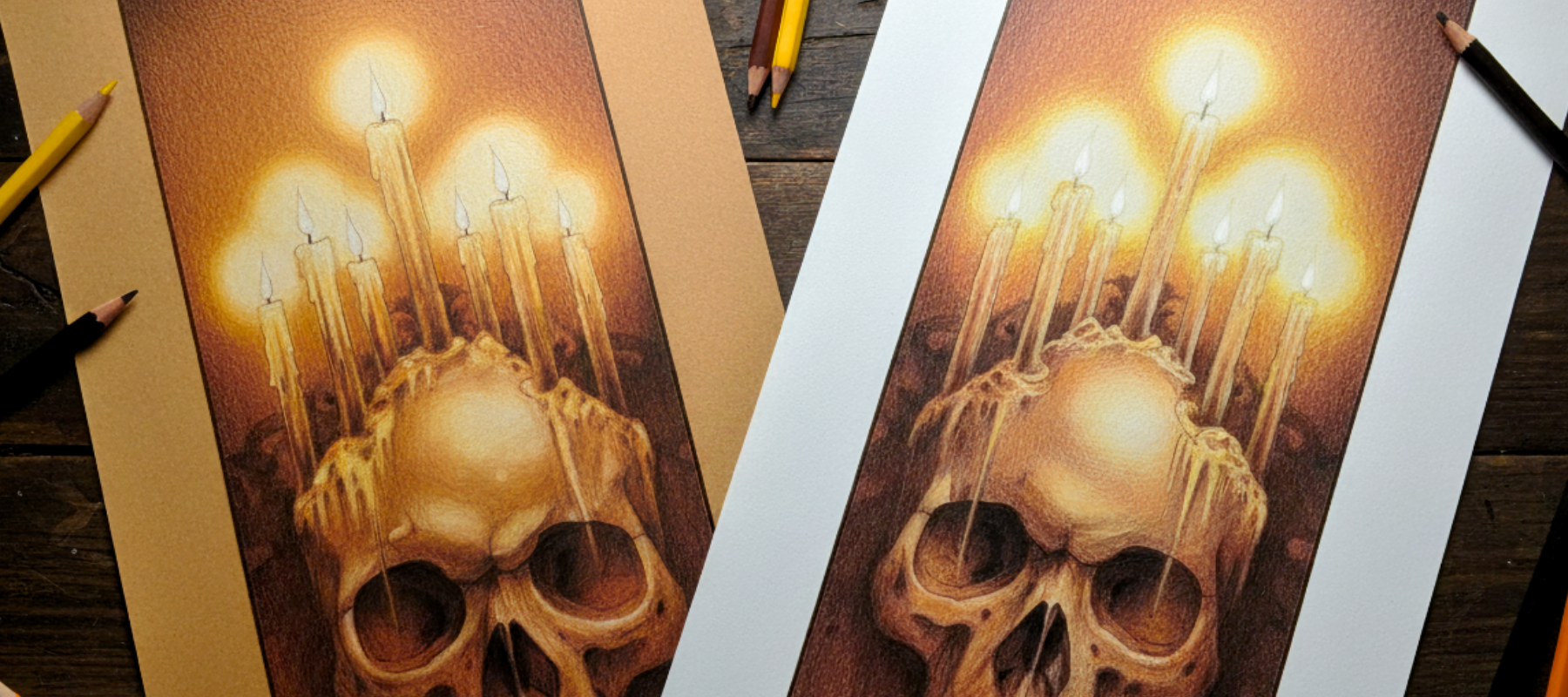
Same artwork, two papers, side by side. See exactly when tan beats white.
About this course
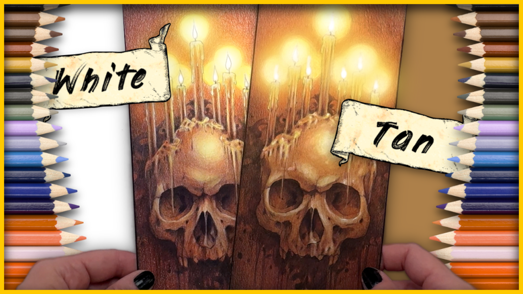
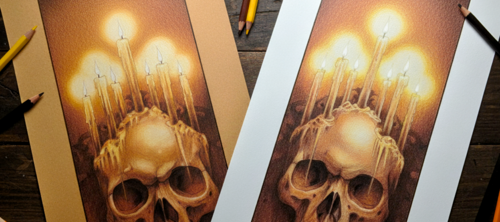
Two pieces, two papers, one experiment. Lisa colors the same artwork twice, side by side, so you can watch exactly what tan paper gives you that white can’t, where white wins back ground tan can’t reach, and how the same color reads differently on each surface.
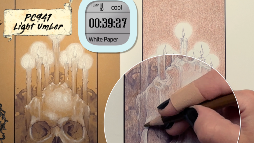
This is a watch-along study, not a narrated tutorial. Every layer goes down on both papers in real time, with the comparison built into every frame. By the last lesson, you’ll know which paper to reach for before you start a project, and why.
This course answers a question artists argue about constantly: when does tan paper beat white, and when does white win it back? Instead of handing you an opinion, I color the same artwork twice, once on each paper, side by side. Every layer goes down on both pieces in real time, so you watch the difference happen rather than hear it described. It is a watch-along study, not a narrated tutorial, and the comparison is in every frame.
The Setup introduces the experiment, then White On Tan. Building Up The Background is where you see what each surface asks of you. A Color Investment looks at what tan gives you from the start, and The Price Of Working On White shows the extra work the white piece needs to gain body and definition. The module ends with Contrast Is Brutal, which shows how openly contrast decisions show up on white.
Catching Up & Comparing looks at warm color moods and the instant glow effect, then at how the white piece catches up on brightness. In Or Out Of Focus? asks how much of the artwork should be sharp. Shadows & Detail is where white wins back ground. You'll see Competing With Paper Color, White On White? and Matching The Warm Yellow Glow, then Building Up Shadows, Gloomy Sfumato and Sharper Detail, until the two pieces are nearly balanced.
The Verdict pulls it together. White still takes longer, black should not be neglected, and fine detail control matters on both papers. We ask whether there is too much or too little detail, strike a balance, light up the flames and land on a verdict. By the last lesson you'll know which paper to reach for before you start a project, and why.
What you'll learn
- Recognize when tan paper beats white, and where white wins back ground
- Judge how the same color reads differently on each surface
- Build warm color moods and a glow effect with tan paper's help
- Match shadows and a warm yellow glow across two different papers
- Balance fine detail so you don't overwork or underwork a piece
- Choose the right paper for a project before you start, and explain why
Inside the course
- The Experiment
- White On Tan
- A Color Investment
- Just Keep Shading, Just Keep Shading...
- The Price Of Working On White
- More Definition And Body
- Contrast Is Brutal
- Warm Color Moods
- Instant Glow Effect
- Catching Up With Brightness
- Still Playing Catch Up
- In Or Out Of Focus?
- Competing With Paper Color
- White On White?
- Nearly Balanced
- Matching The Warm Yellow Glow
- Building Up Shadows
- Gloomy Sfumato
- Consistent Shadows
- Sharper Detail
- Still Longer On White
- Don't Neglect Black
- Fine Detail Control
- Too Much Or Too Little Detail?
- A Balancing Act
- Lighting Up The Flames
- And The Verdict Is ...
Who it's for
- Intermediate colored pencil artists who have wondered whether tan paper is worth using.
- Artists who learn best by watching a process unfold rather than following narration.
- Anyone who wants to understand how paper tone affects glow, contrast and shadow.
- Artists who want to choose their paper with confidence before starting a project.
- Artists who want to see how shadows and atmospheric glow change across two papers.

Your instructor
I'm Lisa Mitrokhin. I've been drawing since I was three years old, I have a master's degree in fine art, and I've taught in real classrooms, online, in groups, and one-on-one. I teach the way the artist brain learns: I show you the one thing to focus on, you try it, and then we move on to the next thing.
Questions about Tan vs. White Paper Coloring
Is this a step-by-step tutorial?
No, it is a watch-along study. I color the same artwork on both papers in real time, and the side-by-side footage does the teaching. The lesson titles tell you what to look out for as each piece develops.
What does tan paper give you that white doesn't?
You watch it happen across the course, from A Color Investment early on to warm color moods and the instant glow effect later. White has to catch up on brightness, which is why lessons like Still Playing Catch Up appear.
Where does white paper come out ahead?
Shadows & Detail is where white wins back ground that tan can't reach. Lessons such as White On White? and Sharper Detail show it, and by Nearly Balanced the two pieces are close.
What will I be able to decide by the end?
You'll know which paper to choose before you start a project, and why. The final lesson, And The Verdict Is ..., gives you the answer after you've seen both pieces finished.
How long is Tan vs. White Paper Coloring?
27 video lessons, about 4h 23m of teaching in total, across 5 modules. It's a intermediate course.
Can I buy just this course?
Yes. Every course is sold on its own and is yours to keep. If you want more than one, Artisans get a big discount on every course, live coaching with me, and a community of artists to draw with. See everything Artisans get →
Do I need expensive supplies?
No. I teach with commonly available brands. Artisans also get the Palette Vault, with brand and color number references so you can follow along with the pencils you already have.
Where do I watch the lessons?
On the academy at academy.itseasytodraw.com, from any web browser on any device.
Artisans get this course for half price.
Keep going
 $97
Make colored pencils look like paint.
 $97
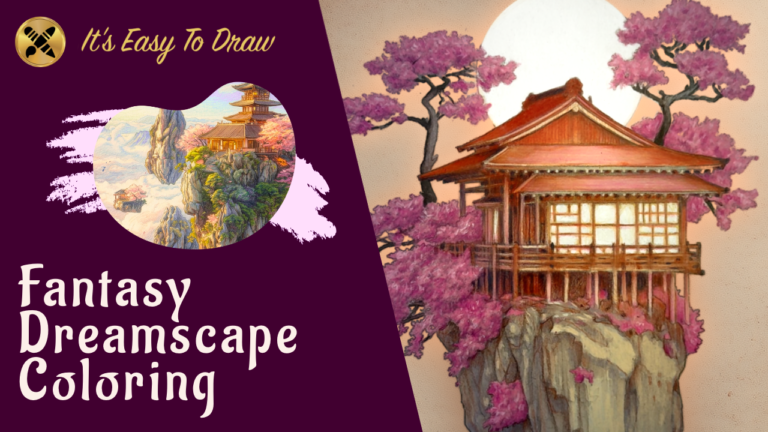
A cherry tree house dreamscape. Atmosphere, light, and fantasy.
 $97
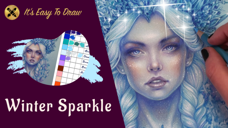
Crystals, icy skin, snowflakes, and glitter. One ice queen, start to finish.