
Colored Pencil Techniques
The techniques that make colored pencil look like fine art. Layering, burnishing, blending, and the supplies that actually matter.
Why Colored Pencils Are Your Best Friend for Learning Art
If you’ve ever wanted to create art but felt overwhelmed by the setup involved with paints or pastels, colored pencils might be exactly what you need. Here at It’s Easy To Draw, we’ve seen hundreds of adult hobbyists and intermediate artists transform their skills using nothing more than a handful of pencils and good paper. Mastering colored pencils enhances drawings through rich saturation, buttery blending, and stunning luminosity, all without the mess of water buckets or turpentine.
Think about it: you could sit down at your kitchen table with a coffee mug in front of you, sketch its basic shape, and start layering color within five minutes. There’s no elaborate setup, no drying time between sessions, and no cleanup beyond putting your pencils back in their tin. This portability and simplicity make colored pencil techniques perfect if you only have twenty or thirty minutes in the evening before the day catches up with you.
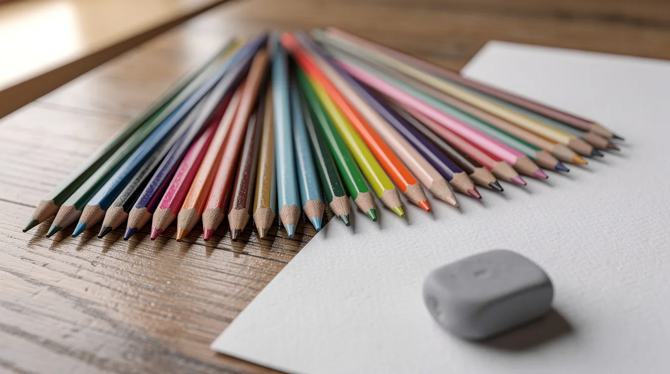
This article will move quickly from basic pencil strokes to advanced blending methods, including layering, solvents, and white pencil techniques, and then into a small step-by-step project outline you can try today. All of these techniques are demonstrated in depth in our course “How to Use Colored Pencils Like a Pro” inside the It’s Easy To Draw online art academy. You don’t need expensive sets to start. A small set of 12 to 24 colors plus a white pencil and kneaded eraser is enough to follow along with everything we’ll cover.
Essential Colored Pencil Supplies (Without Wasting Money)
Materials matter, but not as much as technique and practice. I’ve seen students create stunning colored pencil art with budget sets simply because they understood how to layer and control pressure. That said, understanding your tools helps you make smarter choices.
First, let’s clear up terminology: “colored pencils” and “coloured pencils” are the same thing, just American versus British spelling. Whether you pick up wax-based or oil-based pencils, all the tips in this guide apply equally. Here’s what to consider:
Colored Pencil Tiers:
- Student grade (Crayola, basic Prang): Lower pigment concentration, limited color range, weaker lightfastness. Fine for practice and fun experiments.
- Mid-range (Prismacolor Scholar, Staedtler Ergosoft): Better pigment quality, decent color selection, good for learning without major investment.
- Artist grade (Faber Castell Polychromos, Prismacolor Premier, Caran d’Ache Luminance): High pigment concentration, excellent lightfastness, wide color ranges, superior cores.
Faber Castell Polychromos are oil-based pencils popular for smooth layers and sharp detail retention. They hold a sharp point longer than soft wax pencils, making them ideal for fine work like hair or detailed texture. Many It’s Easy To Draw lessons use Polychromos because of their consistency. Prismacolor Premier, on the other hand, are soft wax pencils that deliver rich, buttery pigment quickly, perfect when you want vibrant saturation fast.
Paper Choice:
- Smooth Bristol (vellum or plate finish): Allows crisp edges and fine detail but accepts fewer layers before the tooth fills
- Medium-tooth drawing paper (90-110 lb / 180-260 gsm): More tooth allows more layers and richer color buildup but shows more visible texture in strokes
The White Pencil: Your white pencil is your best friend for blending, softening transitions, and creating gentle highlights. Options like Polychromos White or Derwent Drawing Chinese White work beautifully. We’ll explore white pencil blending in detail later.
Must-Have Accessories:
- Kneaded eraser: Lifts graphite and softens colored pencil without tearing paper, you can shape it to a point for precision
- Quality pencil sharpener: Electric or hand-crank; keep that sharp pencil ready
- Sandpaper block: For fine-tuning the pencil point
- Blending stumps and cotton swabs: For solvent blending and soft transitions
- Odorless mineral spirits or rubbing alcohol (optional): For wet blending techniques
Foundations: Pressure, Layers, and Pencil Control
Pressure control and layering are the core of all colored pencil techniques. Everything else, blending, texture, realistic effects, builds on these fundamentals. Get them right, and your colored pencil work will improve dramatically.
Pressure applied while using colored pencils significantly affects the value and intensity of the color, with three basic levels identified: light, medium, and heavy, though many transitional levels exist between them. Here’s what you need to know:
- Light pressure: Barely touching the paper. Your first layers should be so faint they look like a “tea stain”, pale, transparent, almost ghostly. This preserves the paper’s tooth for subsequent layers.
- Medium pressure: Moderate contact that builds color density without crushing texture. Most of your layering happens here.
- Heavy pressure: Strong, deliberate strokes used primarily for blending at the end. Don’t do this too early because it’s difficult to adjust.
I recommend starting with light pressure to avoid damaging the paper, as applying too much pressure initially can prevent the drawing surface from accepting more layers of color. Once you crush the tooth, you’re locked out of adding depth.
Increasing the pressure with each subsequent layer of color is necessary to ensure that the pigment adheres properly to the paper, transitioning from light to medium or heavier pressure as you add more layers. Think of it as gradually filling the valleys in the texture of your paper rather than smashing it flat from the start.
Simple Pressure Exercise: Create a gradient bar using one color (try Dark Cadmium Red). Start at one end with barely-there pressure and gradually increase to heavy pressure at the other end. Watch how the saturation and value change. This ten-minute practice reveals more about pencil control than hours of random coloring.
Pencil Angle Tips:
- Shallow angle (pencil nearly flat): Covers large area quickly, creates soft shading
- Steep angle (pencil more upright): Crisp edges, tight details, fine directional lines
Sharpness Matters: Keep a sharp point for eyelashes, fur strands, and intricate texture. Use a slightly rounded tip for soft skies and smooth gradients where you’re covering ground quickly.
10-Minute Warm-Up Routine:
- Two pressure gradient bars (different colors)
- Two rows of circles transitioning from light to heavy pressure
- One strip of tiny directional hatch marks with increasing pressure
Core Colored Pencil Strokes and Mark-Making
Different pencil strokes create different textures, and practicing them in dedicated swatches speeds up your learning dramatically. Think of this as building a vocabulary, the more stroke types you master, the more subjects you can render convincingly in your own drawings.
Main Stroke Categories:
- Directional lines: Smooth back-and-forth movements following the form of your subject. Perfect for skin tones, skies, and any area needing even coverage. When these lines follow a consistent direction, they create cohesive shading that reads as a unified surface.
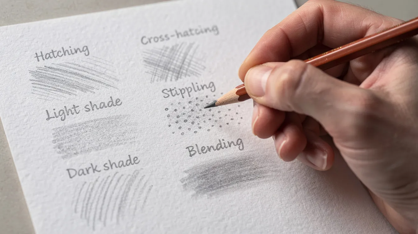
- Hatching: A technique where a series of parallel lines are drawn in the same direction, which can create shading and texture in a drawing. Use hatching for subtle value shifts, wood grain, or fabric folds.
- Crosshatching: Layer hatched lines at different angles to build denser shadows and richer texture. Great for darker areas where you need depth without heavy pressure.
- Scumbling: Scumbling involves making continuous circular marks on your paper without lifting your pencil, which can fill areas with lots of color and create textures. This technique produces velvety surfaces, ideal for clouds, soft stone, or fruit skin like oranges.
- Circling: Tight, small circular motions (tighter than scumbling) for very smooth coverage. Circling with a sharpened pencil at light pressure creates smooth, even gradients suitable for skin tones or soft objects.
- Stippling: Stippling involves placing lots of tiny dots on your paper, which can be close together or far apart, and is a great way to add interesting texture to a drawing. Use it for freckles, sand, distant foliage, or porous surfaces.
- Scribble marks: Energetic, random strokes for organic subjects like grass, loose foliage, or flames.
Subject-Specific Applications:
- Hair: Long sweeping directional lines following growth patterns
- Fur: Short, varied strokes with different pressures
- Grass and fields: Broken, upward-flicking marks
- Stone with lichen: Combined stippling and scumbling
Create a Stroke Library: Dedicate a page to practicing each stroke type with several colors. Date it (e.g., “Stroke Sheet, 14 May 2026”) and label boxes for each technique. This reference sheet becomes invaluable when you’re deciding which approach to use for a specific texture.
Essential Shading and Blending Techniques
Blending in colored pencil is mostly about layering and pressure control, not smudging like you would with graphite or soft pastel. The medium rewards patience and planning.
Pressure Shading: Using the same color with varied pencil pressure shifts value from light to dark. Practice this on a simple sphere: leave a highlight zone white, apply light colors at medium pressure around it, then build shadows with progressively heavier layers. This single exercise teaches form, light direction, and depth.
Layering (Glazing): Layering, or glazing, involves applying overlapping, transparent coats of different colors using light pressure to mix colors directly on the paper. Because colored pencil applications are somewhat translucent, layering different colors allows for blending and mixing that creates interesting effects you can’t achieve with single-pass coverage.
Layering enables the creation of subtle shifts in value and color temperature necessary for realistic textures. Build your darks gradually. Many light layers beat one heavy pass.
Optical Blending: Optical blending is a technique where colors are layered in such a way that they visually mix without physically blending, creating new colors at the intersection of the layers. For example, layering yellow over blue creates the perception of green. This keeps colors vibrant and luminous compared to pre-mixed greens.
Burnishing Technique: Burnishing is a blending technique that involves applying heavy pressure on the final layer of colored pencil to create a smooth, polished finish where no paper texture is visible. This produces a glossy, almost painted surface, perfect for polished metal, shiny fruit, or reflective surfaces. The critical timing: burnish only near the end of your drawing process. After burnishing, the tooth is filled, and adding more pigment becomes almost impossible.
White Pencil Blending: White pencil blending involves using a white colored pencil over existing colors to create a soft, hazy blend, allowing you to add highlights and deeper colors afterward. It softens edges, slightly lightens tones, and fills gaps between pigment particles. Be careful, though. Overuse can make colors look chalky.
Solvent Blending: Solvent Blending uses a dampened cotton swab with rubbing alcohol or odorless mineral spirit to blend colors by melting the wax binder. This unifies strokes and creates smooth, painterly effects. It works especially well for backgrounds, skies, and soft fur. Make sure your paper can handle moisture, and work in a ventilated space.
When to Use Each Method:
- Burnishing: Bold, shiny surfaces (polished fruit, metal, glass)
- Optical blending: Luminous skin, delicate fabrics, vibrant florals
- Solvent blending: Large area backgrounds, smooth skies, soft animal fur
- White pencil blending: Gentle transitions, subtle highlights, hazy atmospheres
Texture and Special Effects with Colored Pencils
Texture is where colored pencil art becomes convincing and fun. Hair, glass, stone, leaves, each material has its own character, and the right techniques bring them to life.
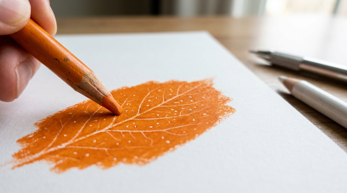
Impressing (Embossing): Impressing is a technique where you create etchings in the paper before applying color, allowing for unique textures when colored pencil is applied over the indentations. Use a stylus, empty ballpoint pen, or hard white pencil to press lines into your paper before coloring. These impressed lines resist pigment, remaining light even as you layer over them. Perfect for fine hairs, whiskers, leaf veins, and highlights.
Frottage: Place your paper over a textured surface, tree bark, brick, coins, and shade with a soft pencil to pick up the pattern. This creative experiment works wonderfully for abstract backgrounds or adding interesting effects to landscapes. It’s not just a gimmick; it’s a legitimate tool for certain subjects.
Powder Dusting: Collect pigment dust from sharpening soft colored pencils and gently rub it onto paper with a tissue or soft brush. This creates soft backgrounds, atmospheric skies, and subtle fog effects that would take hours to achieve with direct pencil application.
Directional Lines for Realism: Flowing lines along hair growth create convincing hair. Curved pencil strokes around cylindrical objects reinforce form. Varied line length suggests grass and organic materials. The direction of your strokes matters as much as the color you choose.
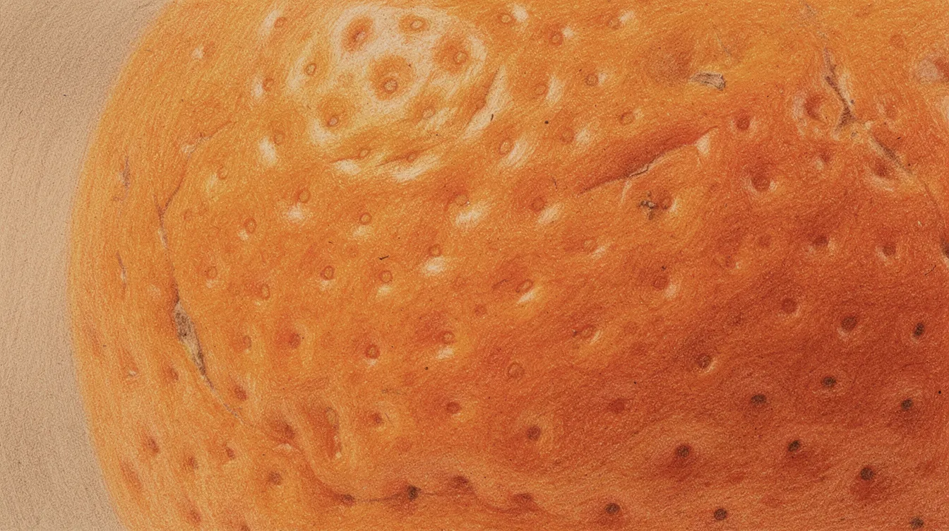
Combining Techniques: Scumbling and stippling together work beautifully for organic textures. Use tiny scumbled circles for the base of an orange rind, then add stippled dots for pores. Layer these approaches for stone surfaces, strawberries, or lichen-covered rocks.
Creating Highlights: Combine white pencil with light burnishing and selective erasing using a kneaded eraser to pull out highlights. This trio creates convincing reflective textures in glass, water droplets, and polished fruit. Using lighter pencils to build highlights can create luminous, glowing effects against darker shadows.
Color Theory for Colored Pencil Artists
Basic color theory helps you avoid muddy mixes and makes even limited sets of colored pencils feel much larger. You don’t need a degree, just a few principles.
Primary, Secondary, and Tertiary: Red, yellow, and blue are primaries. Mix them to get secondaries (orange, green, purple). Tertiaries fill the gaps between. The beauty of optical blending is that you can “mix” these directly on paper by layering transparent pencil strokes, yellow over blue suggests green without ever using a green pencil.
Warm vs. Cool: Every hue has warm and cool versions. A warm red leans toward orange; a cool red leans toward magenta. This matters when layering and shading because mixing warms and cools can either enrich your colors or muddy them unexpectedly.
Complementary Colors: Red and green, blue and orange, yellow and violet sit opposite each other on the color wheel. Using a complement in your shadow areas neutralizes and deepens color without going muddy. For example, adding a light layer of red beneath a green apple’s shadow creates richer, more realistic depth.
Layering Order Matters: The order in which colors are applied during layering matters, as the underlying color can dominate the final appearance of the artwork. A yellow base under orange reads differently than orange under yellow. Experiment with both to see which effect you prefer.
Specific Examples:
- Underpaint a green apple’s shadow with light red before adding your greens
- Create richer purples by layering magenta over ultramarine blue
- Warm up skin shadows with touches of orange beneath cooler violet tones
Colors Never Dry: Unlike paint, colors in colored pencil art never truly dry, allowing for indefinite glazing, modification, and adjustment of the palette. You can always add more layers, shift temperatures, or adjust values, the medium stays workable.
Limited Palette Practice: Choose three to five pencils and create a chart of blends and swatches. This teaches you how your specific set behaves and reveals combinations you’d never discover otherwise. Inside the It’s Easy To Draw membership, we offer downloadable color wheels and swatch charts for structured exercises.
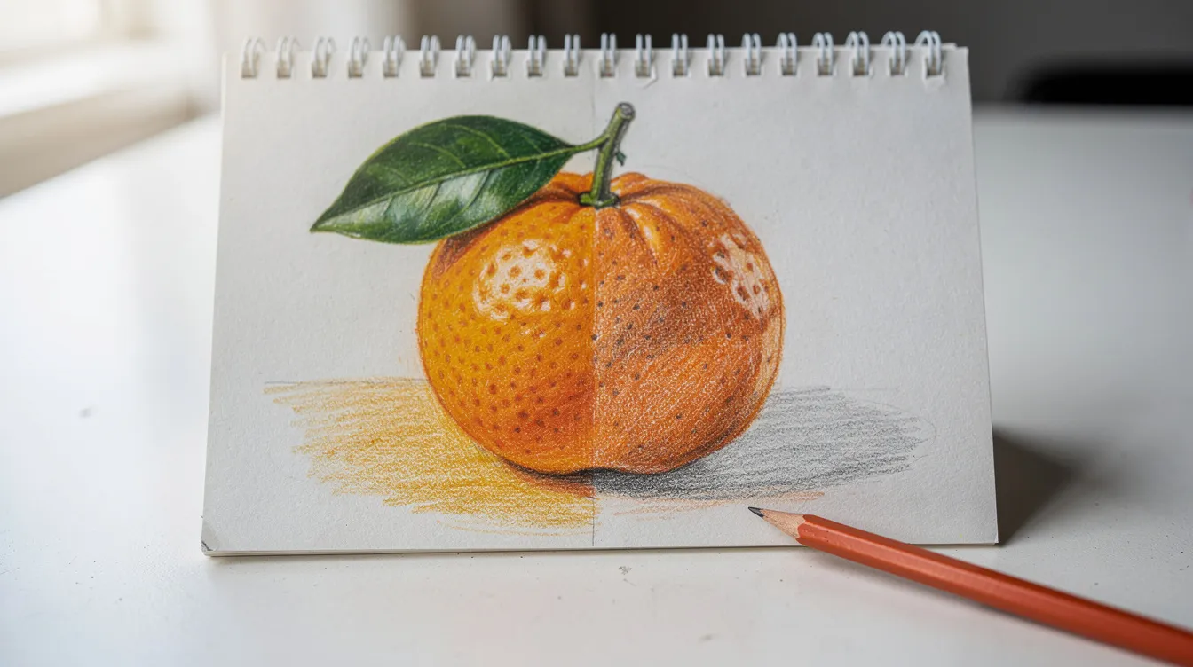
Step-by-Step Mini Project: Drawing a Realistic Mandarin
This project condenses techniques from a full lesson in the It’s Easy To Draw course library. Gather common colors and tools, and let’s create something beautiful.
Reference Setup: A single mandarin with a leaf on white paper, lit from the left. We’ll use Faber Castell Polychromos or similar colors: Light Chrome Yellow, Cadmium Orange, Dark Cadmium Orange, Permanent Green, Raw Umber, and White.
Step 1, Line Drawing: Use light graphite or a pale colored pencil to map the main outline and leaf shape. Keep lines clean and minimal. Soften with a kneaded eraser to prevent show-through under your colors.
Step 2, White Underlayer and Embossing: Lightly block in the highlight zone with your white pencil. Using an embossing tool or hard white pencil, press tiny dots into different areas where you want visible pores. Press a few veins into the leaf. These impressions will resist pigment and create interesting texture later.
Step 3, First Color Layer: Apply Light Chrome Yellow in gentle circling strokes around the highlights, keeping pressure very light. Add a thin layer of Cadmium Orange over the rest of the fruit using the same circling motion. The goal here is establishing base colors, not density.
Step 4, Developing Values: Deepen the shadow side with Dark Cadmium Orange and a touch of Raw Umber, still using circling strokes. Build the leaf with Permanent Green using directional lines that follow its natural curve. Notice how the impressed veins stay lighter as you add color around them.
Step 5, Texture and Details: Add stippled dots and tiny scumbled circles on the rind for that characteristic orange skin. Darken areas around the embossed pores to make them pop. Refine the cast shadow beneath the fruit with layered greens and browns, shadows often contain reflected color from nearby objects.
Step 6, Final Layer and Highlights: Use your white pencil or a light yellow to burnish the sunlit areas, preserving some texture for realism. You can use a colorless blender or light solvent application for the smoothest sections. Add highlights with gentle white pencil strokes or a white gel pen for maximum brightness.
Mindset, Practice Habits, and Using Courses Effectively
Colored pencils are slow, and that can feel frustrating but also meditative and deeply rewarding when approached with the right mindset.
Embrace Patience: Many realistic colored pencil pieces take several sessions or weeks. Instead of expecting instant masterpieces, schedule small daily blocks. Even fifteen minutes of focused practice builds skills faster than occasional marathon sessions.
Draw What You Love: Sketch your pets, favorite snacks, flowers from your own balcony. This emotional connection keeps motivation high and shows in your finished artwork. A subject you care about inspires better observation and more patience.
Low-Pressure Practice: Adult coloring books and printable coloring pages provide excellent low-pressure practice for smooth shading, color combinations, and pencil control. They remove the intimidation of drawing from scratch while still building essential skills.
Avoid Comparison Traps: Social media shows polished final results, not the hours of practice behind them. Use other artists’ work as study material, such as watch how they handle texture and light, rather than as a yardstick for your own worth.
Balance Structure and Play: Alternate formal lessons (like those at It’s Easy To Draw) with “just for fun” drawings. Structured courses build technique; personal projects build creativity. Both matter.
Find Community: Getting feedback, sharing progress, and asking technique questions accelerates learning. Our member community, Reddit, and Discord offer spaces to connect with fellow artists who understand the journey.
Troubleshooting Common Colored Pencil Problems
Most frustrations have simple technical fixes. Here’s your quick reference guide:
| Problem | Cause | Quick Fix |
|---|---|---|
| Grainy or speckled color | Too few layers, too much early pressure, or large tooth paper | Add more light layers using circling strokes; try a smoother paper next time |
| Wax bloom (whitish film on dark areas) | Excess wax rising to surface after heavy burnishing | Gently wipe with soft cloth; seal with light fixative; use less pressure next time |
| Muddy colors | Too many unrelated hues layered heavily; poor color planning | Plan color families before starting; use complements sparingly and only in shadows |
| Overworked paper (dull, won’t accept more pigment) | Crushed tooth from heavy early pressure | Prevention is key: lighter touch, more optical blending; sometimes you must accept where you are |
| Small mistakes | Misplaced marks, wrong colors | Lift with kneaded eraser, add thin white pencil veil, or incorporate into shadow or background |
| Graphite smudging into color | Underdrawing too dark or not erased enough | Use very light graphite, partially erase before adding color, or switch to a colored pencil underdrawing |
When your form looks flat, check your light source. When texture seems wrong, experiment with different stroke combinations. Most problems reveal themselves when you step back and analyze what the surface is actually doing versus what you intended.
Next Steps with It’s Easy To Draw
Thoughtful pencil strokes, controlled pressure, and patient layering turn simple colored pencils into a powerful fine art medium. You now have the techniques, what matters next is practice.
Take Action Today: Download the free colored pencil practice sheet from It’s Easy To Draw. It includes value scales, stroke boxes, and mini sphere exercises designed to implement everything you’ve learned immediately.
Explore Our Courses: For structured learning, check out “The Fundamentals of Drawing” and “How to Use Colored Pencils Like a Pro”, available as standalone courses or inside our membership. Free preview lessons let you experience the teaching style before committing.
Join the Community: Share your work, ask questions, and stay accountable in our course platform community, on Reddit, or Discord. Learning alongside others transforms isolated practice into something richer.
Your very next page of pencil strokes could be the start of a new creative habit, not just a single drawing. Pick up those pencils, sign up for a lesson, and watch what happens when consistent practice meets solid technique.